FYERS / Brand and website overhaul
A platform for people born to trade.
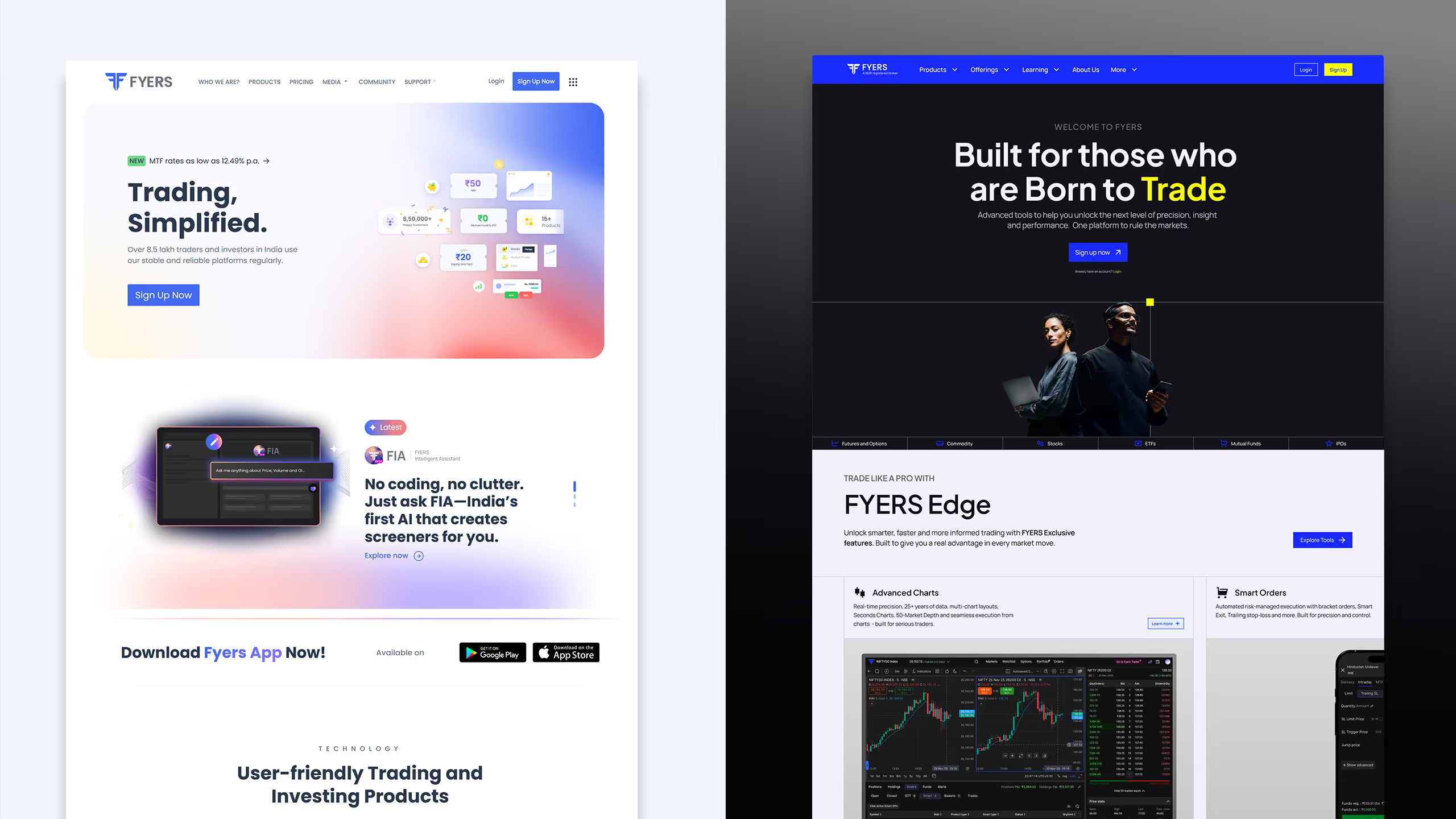
A 14-month brand overhaul that turned a strategic direction into a scalable visual system for product storytelling, campaigns, content, and the evolving FYERS website.
- Role
- Creative Director
- Team
- Neerav Doshi, Pratik, Akanksha, and FYERS teams
- Scope
- Strategy, art direction, system, guidelines, workshops, website
- Timeline
- 14 months; direction finalised in the first 5–6
Beyond a new look.
FYERS already had the product depth to serve serious traders and investors. The opportunity was to make that depth visible, and to give the brand the same deliberate, capable energy as the people using it.
I led the overhaul from early strategic exploration to an external-facing system that could travel across web, content, campaigns, and product touchpoints. The goal was not a cosmetic refresh; it was a sharper expression for a platform built for people who approach wealth-building with intent.
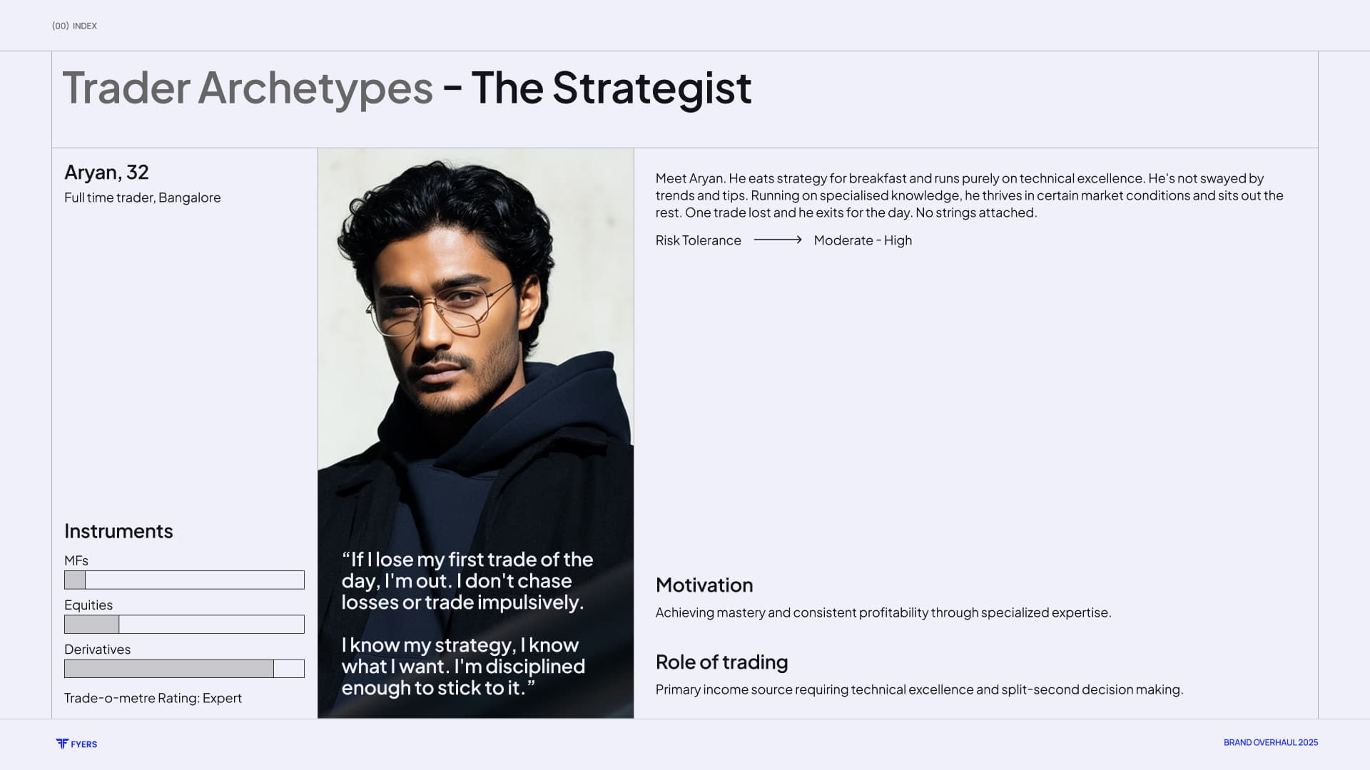
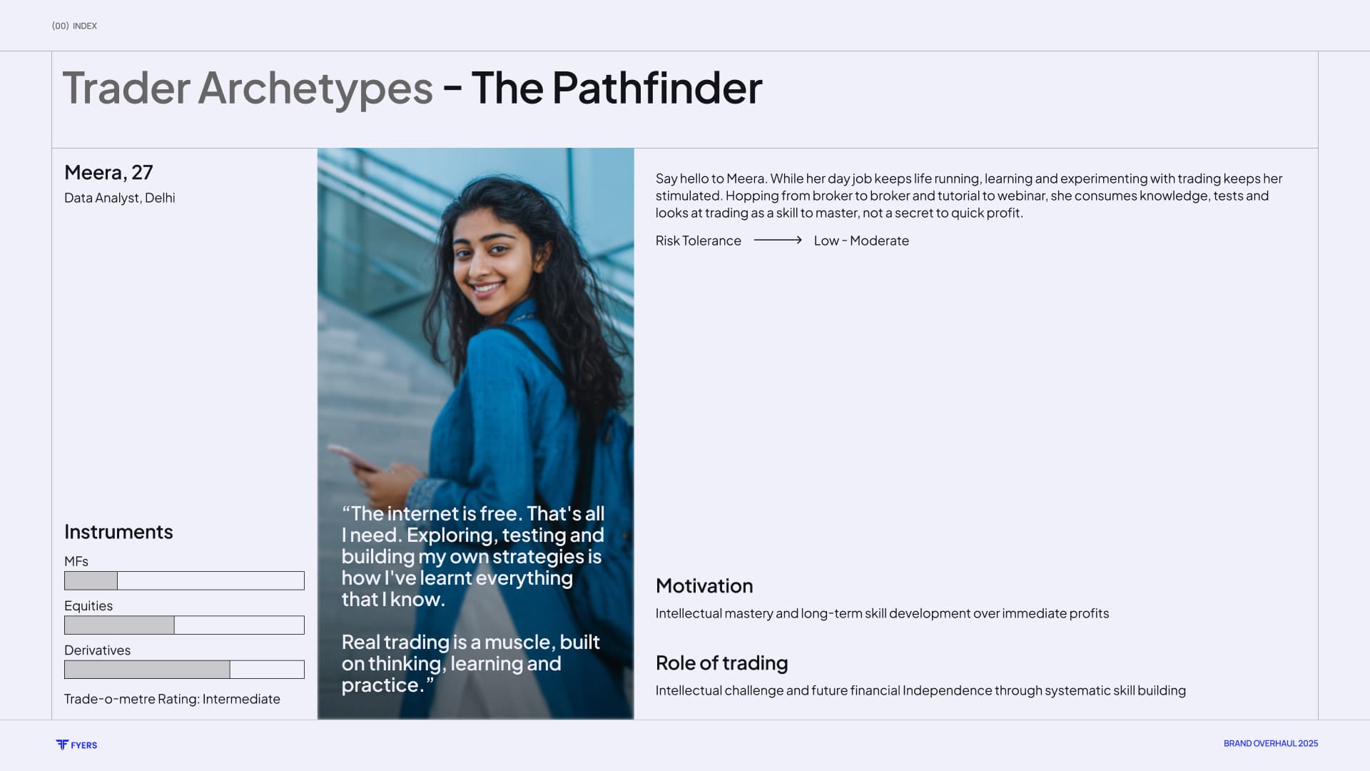
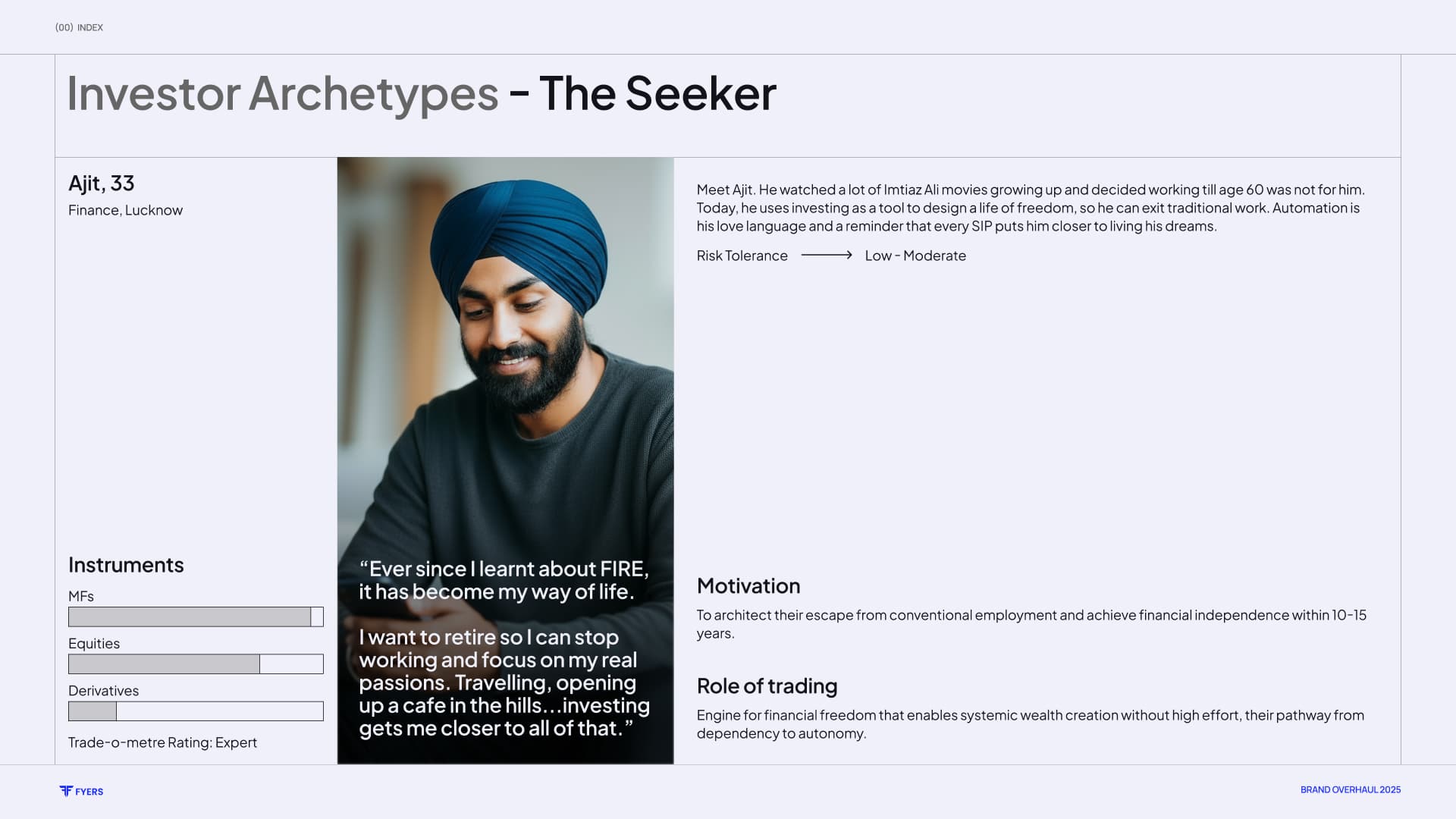
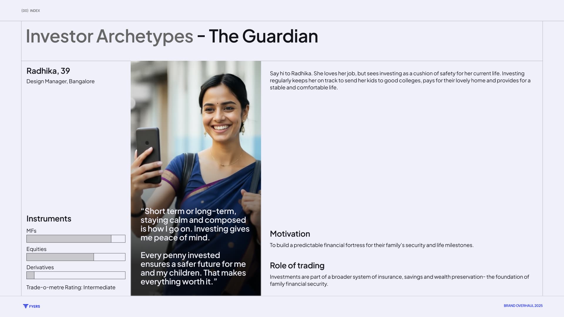
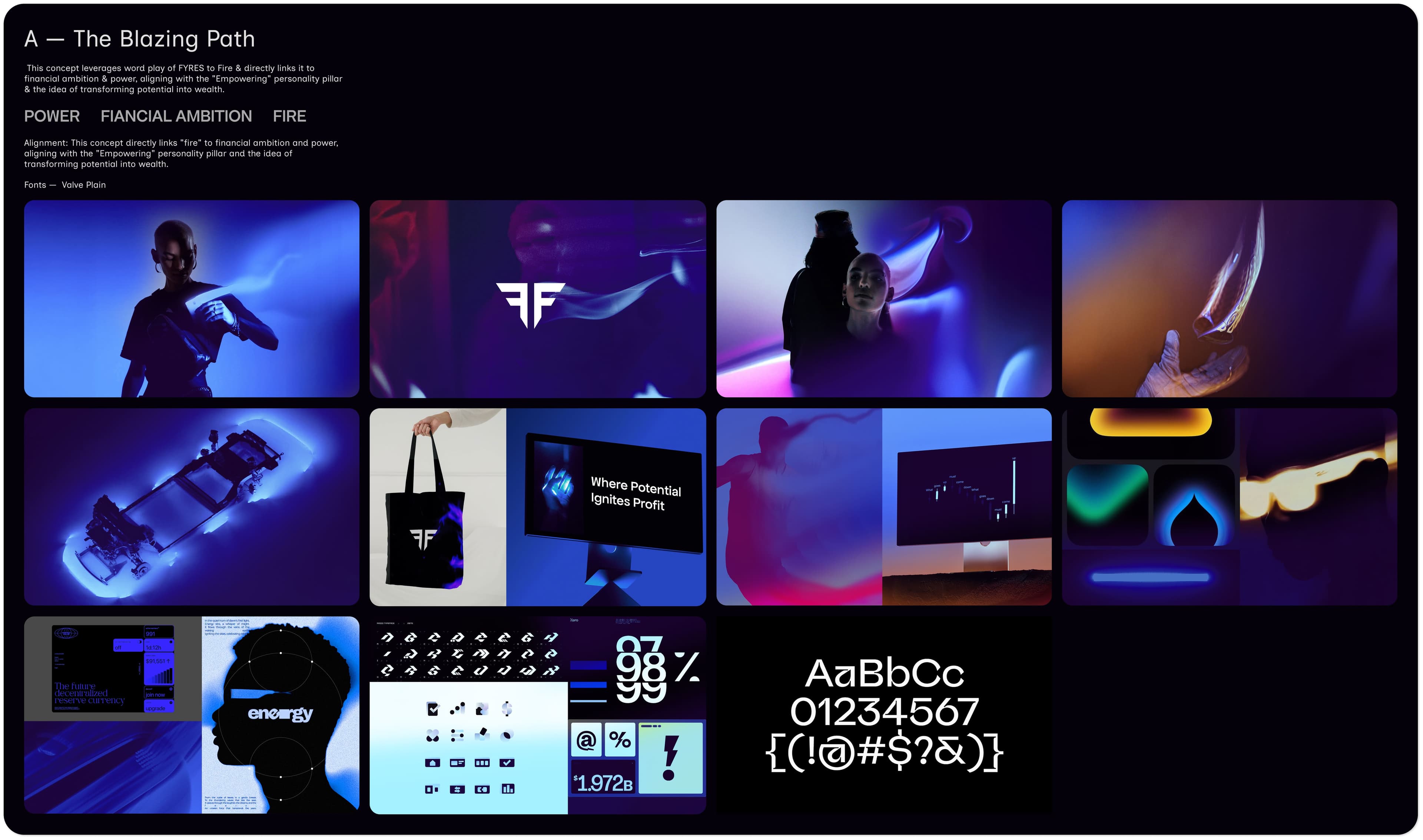
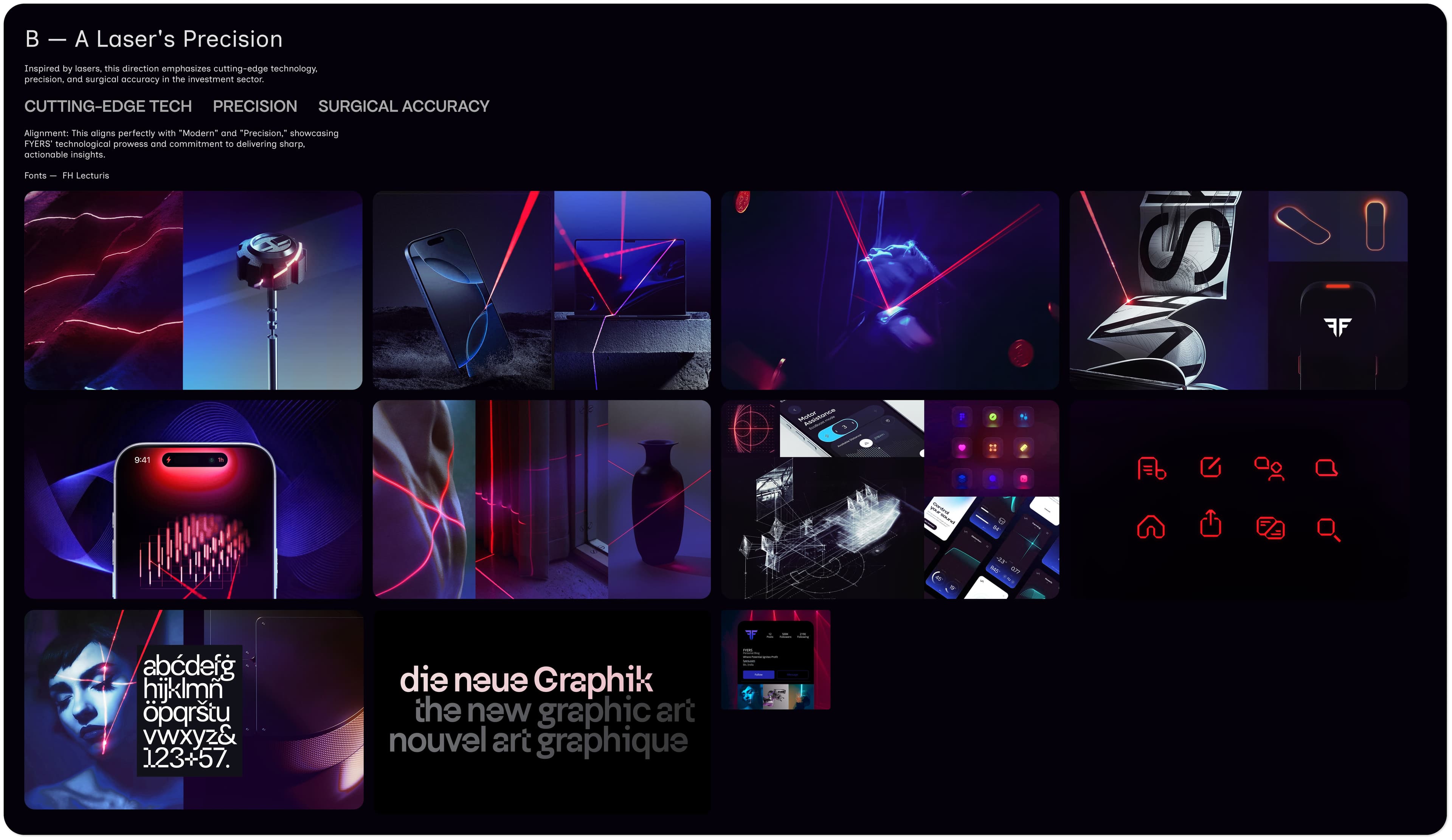
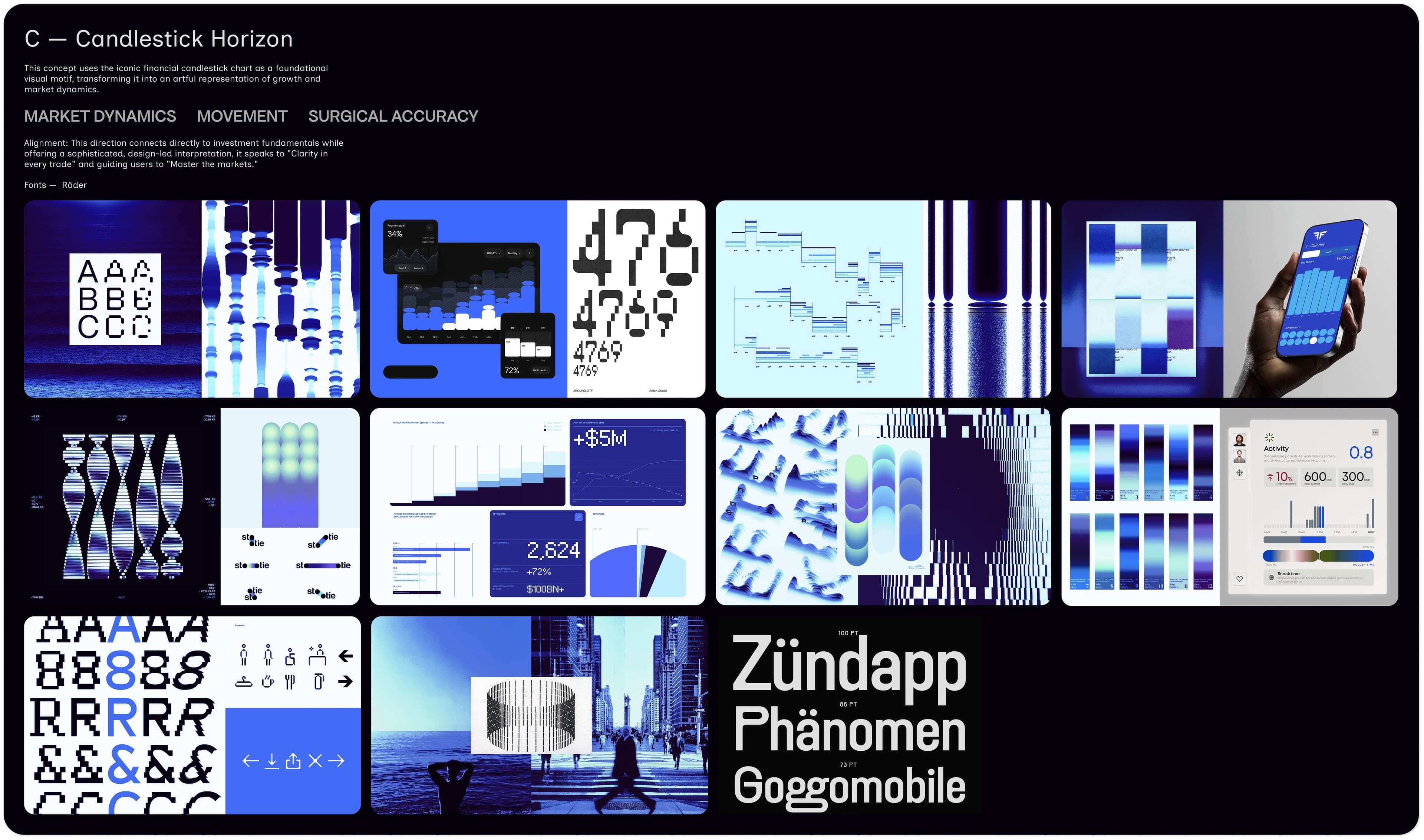
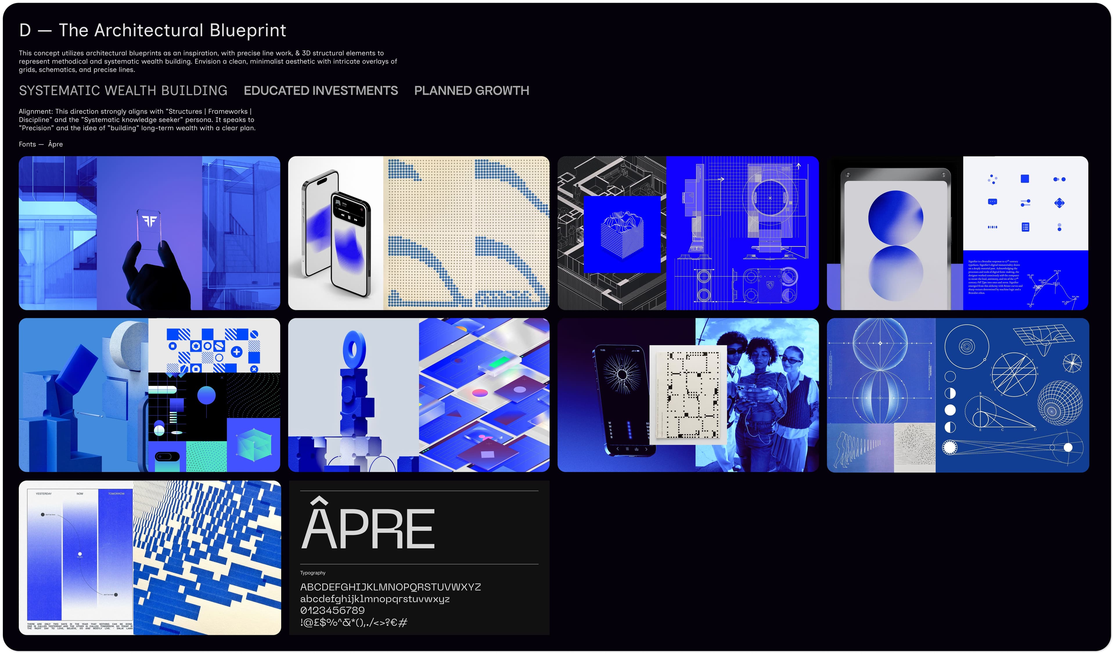
Four routes. One foundation with room to grow.
The architectural route stood apart. It made systematic wealth-building and educated decision making tangible, while staying technical without becoming cold. More importantly, it was not a decorative metaphor: a blueprint could shape a landing page, campaign image, product mockup, illustration, or motion frame.
Brand OS
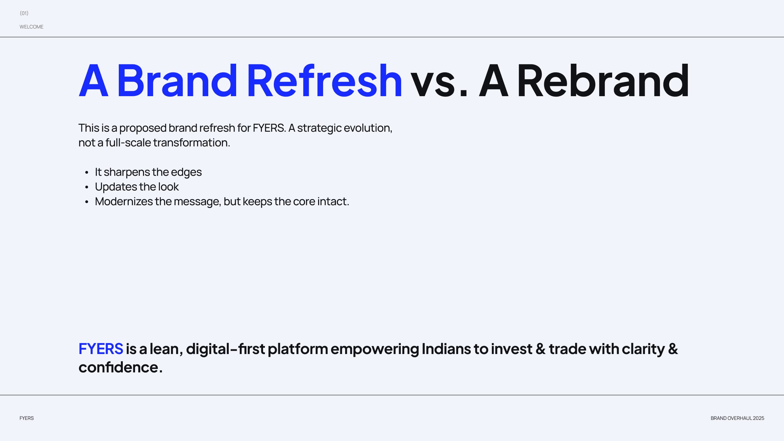
From mood board to a working visual system.
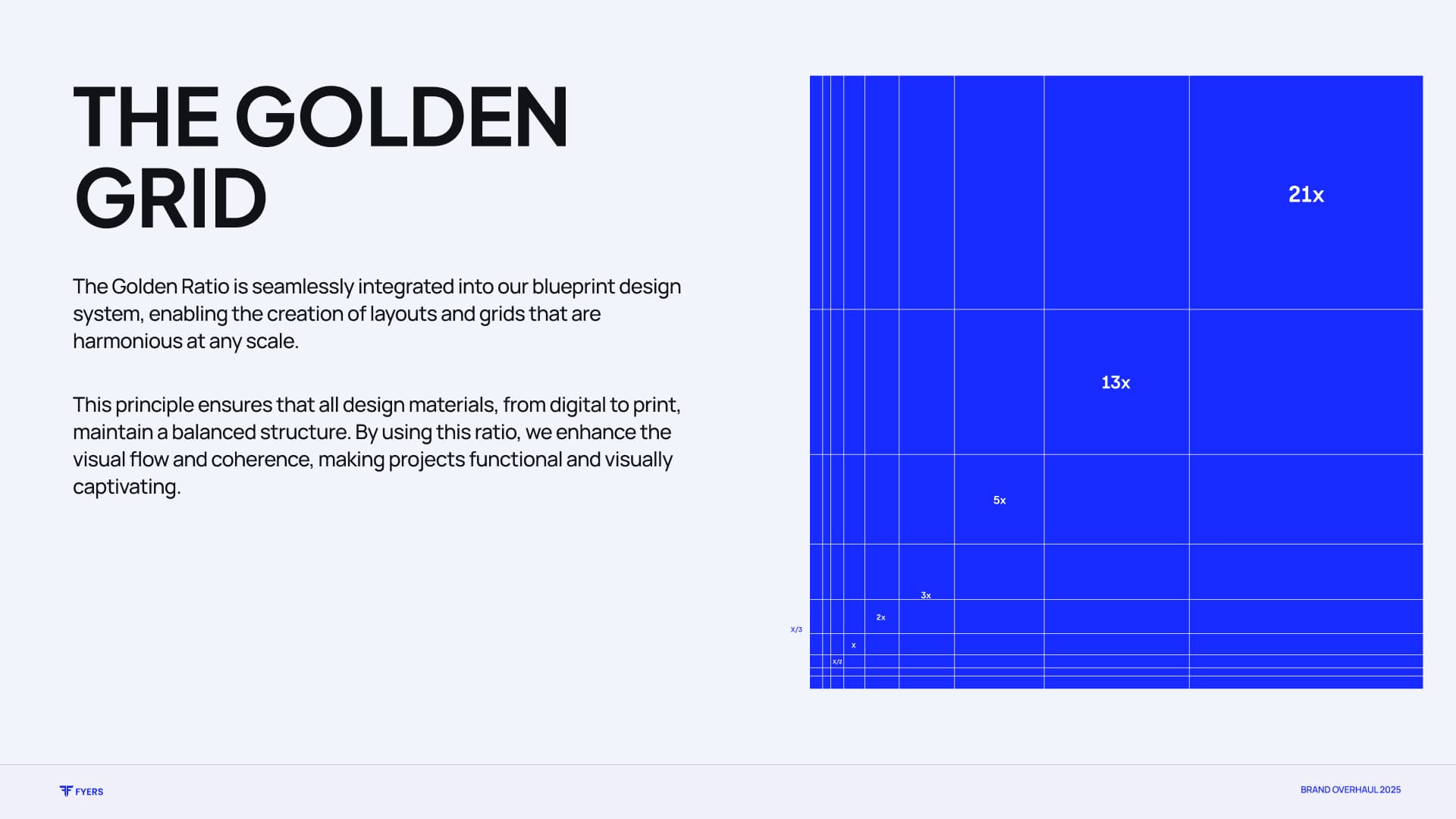
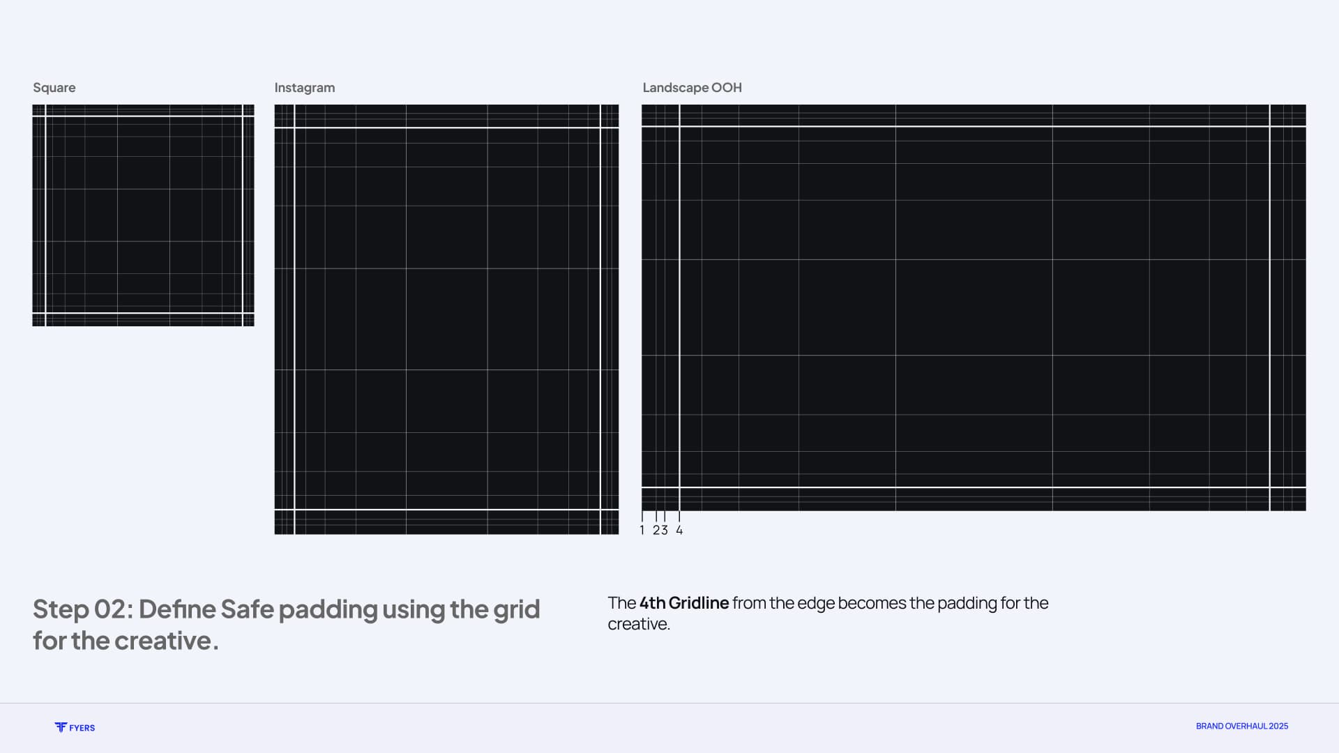
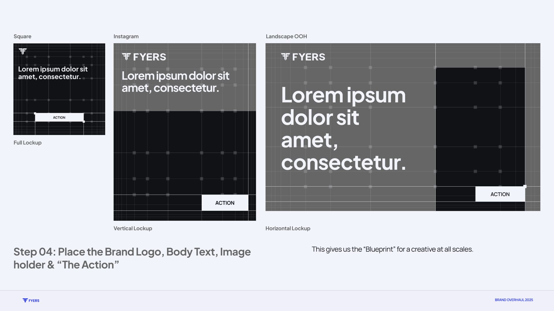
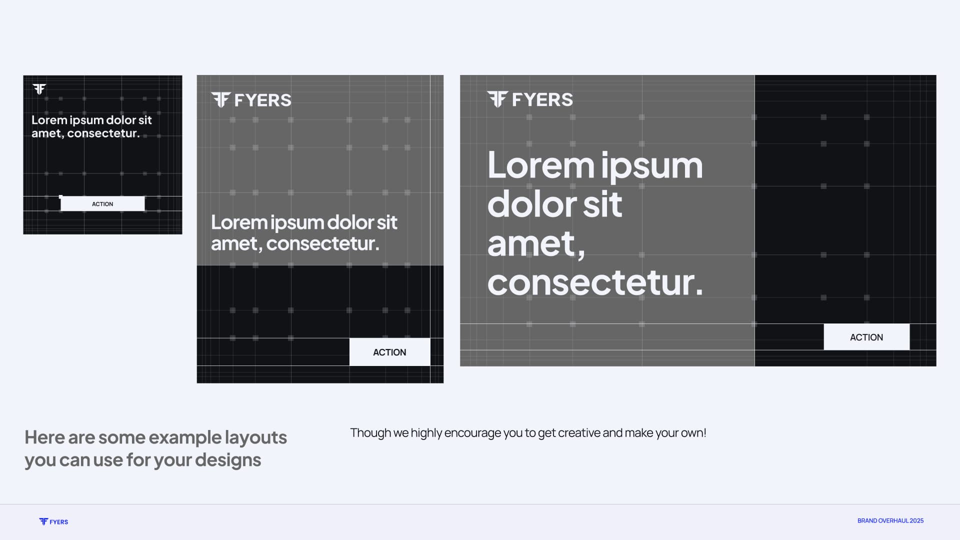
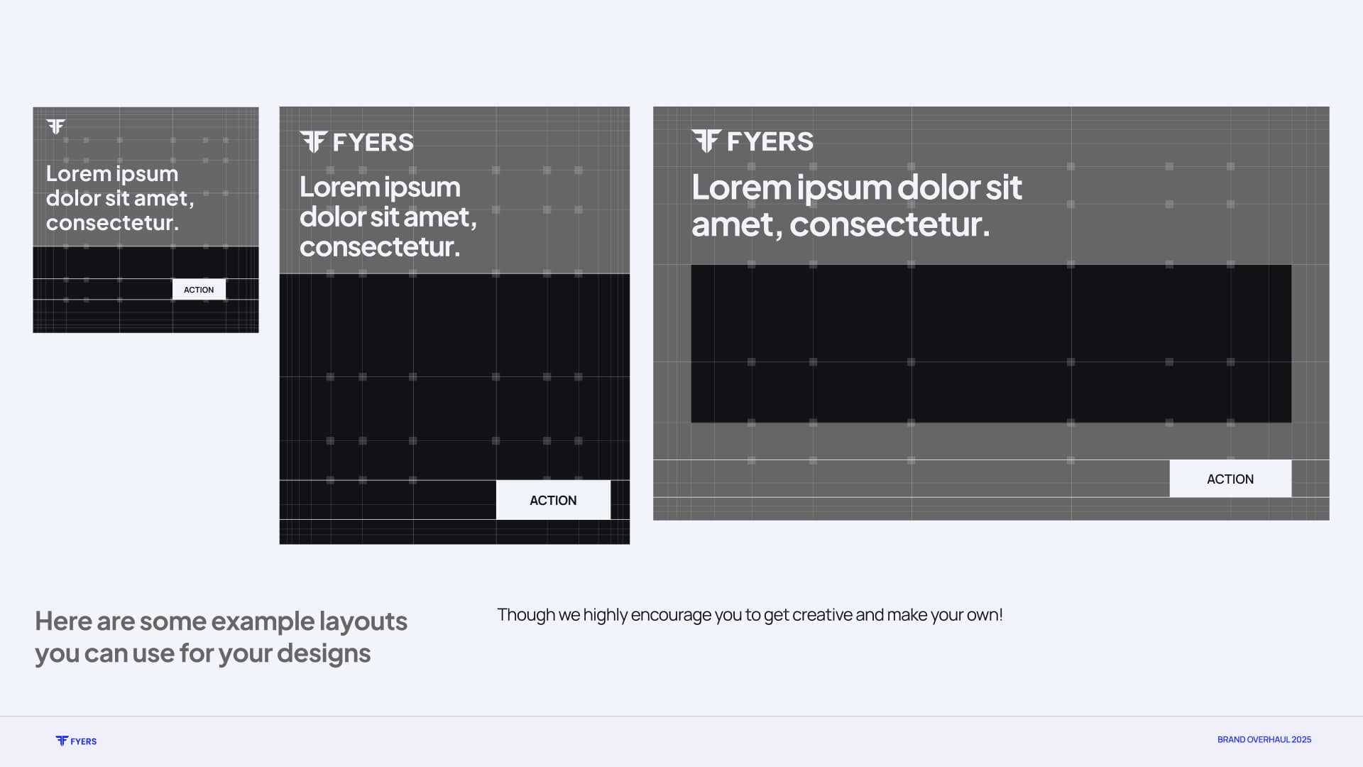
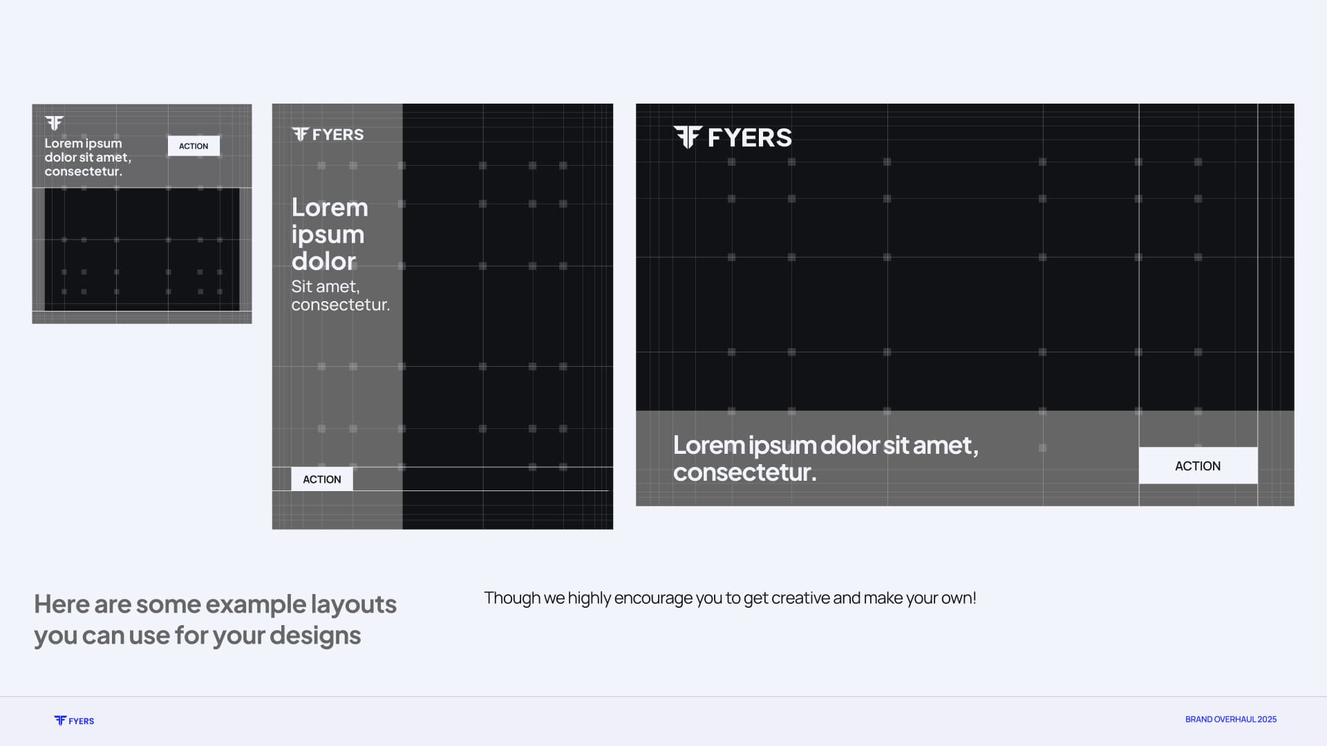
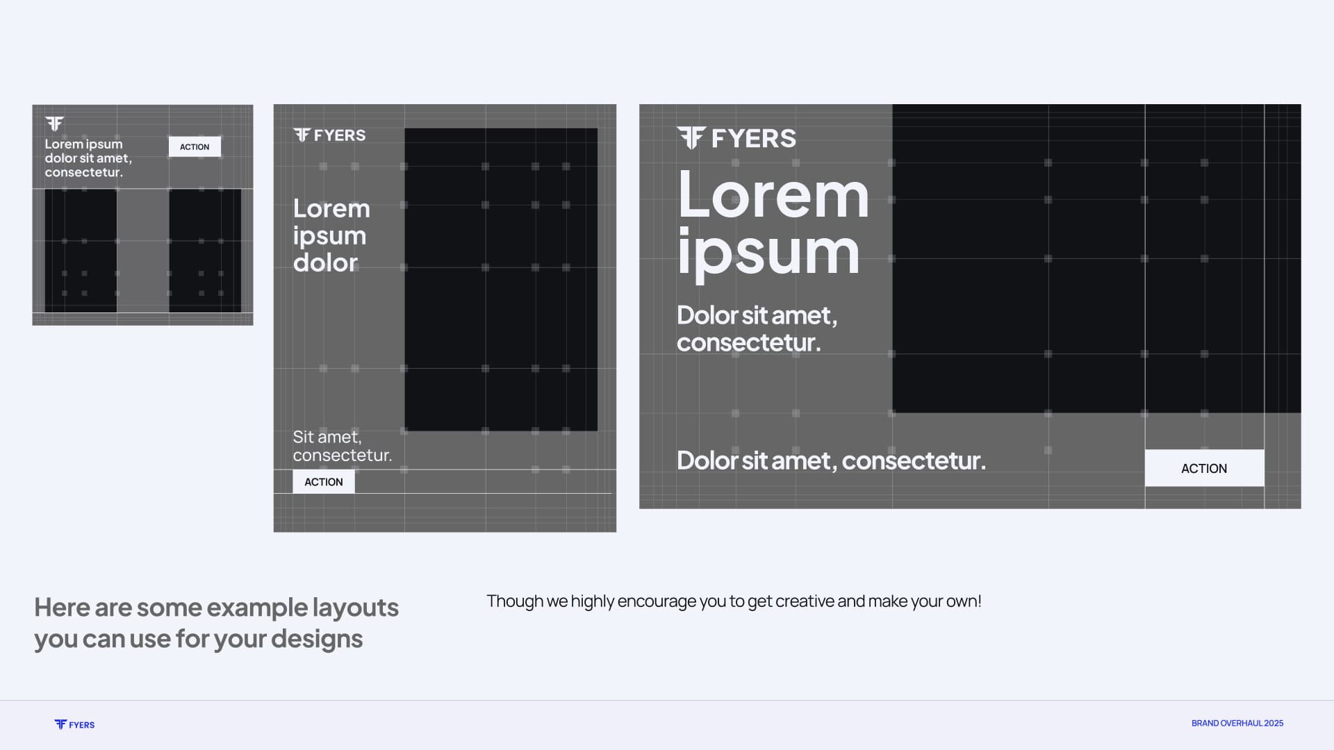
Sharp geometry, measured grids, isometric forms, and structural depth turned the initial idea into a focused visual world. Blueprint lines began to organise layouts as much as images.
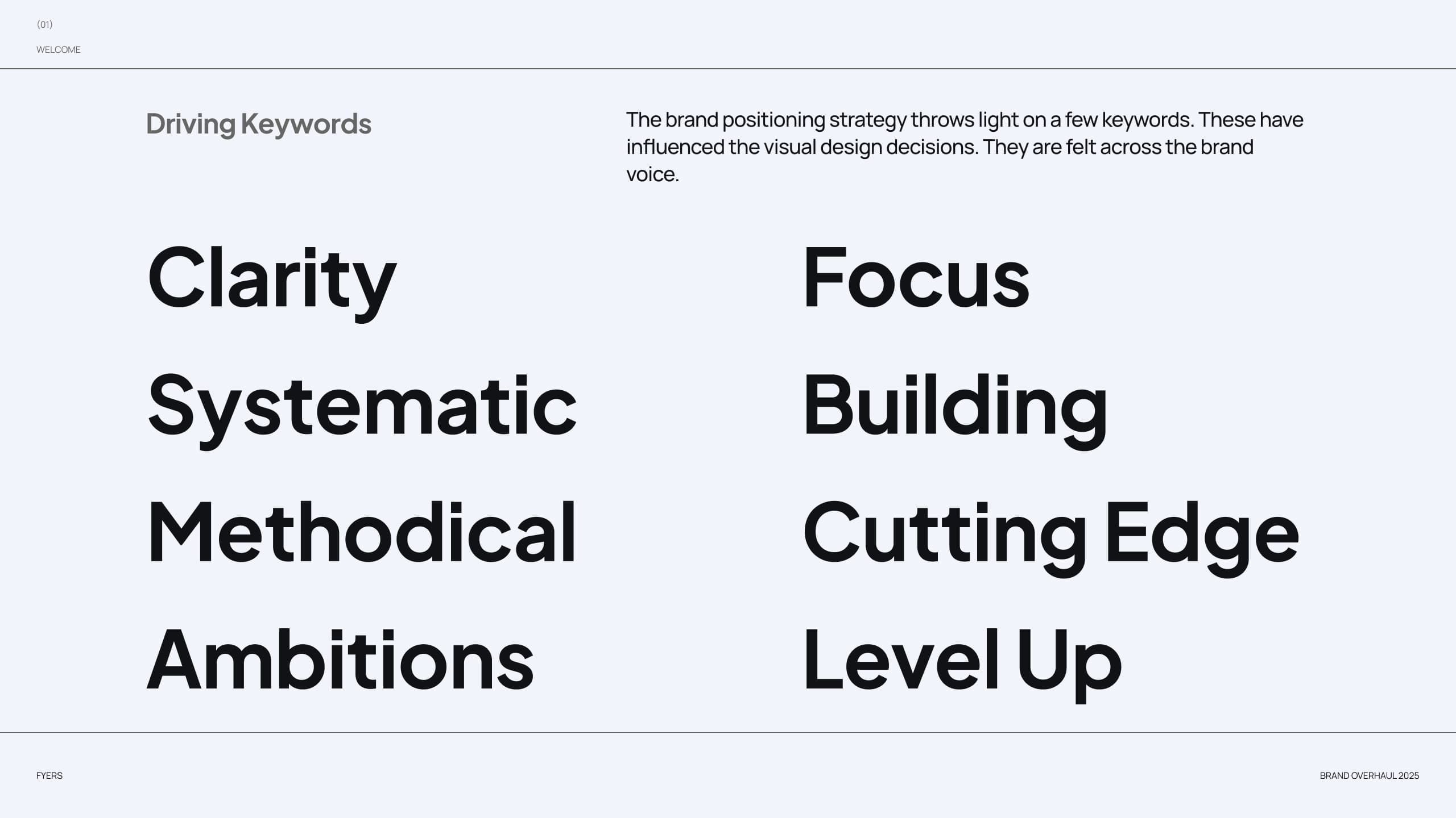
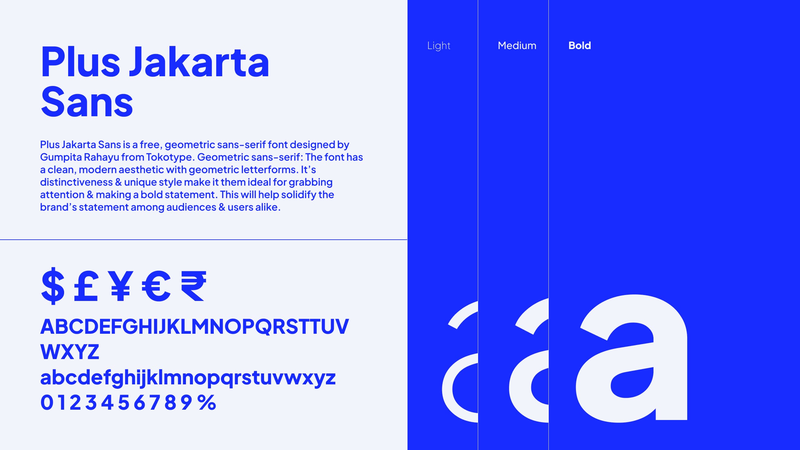
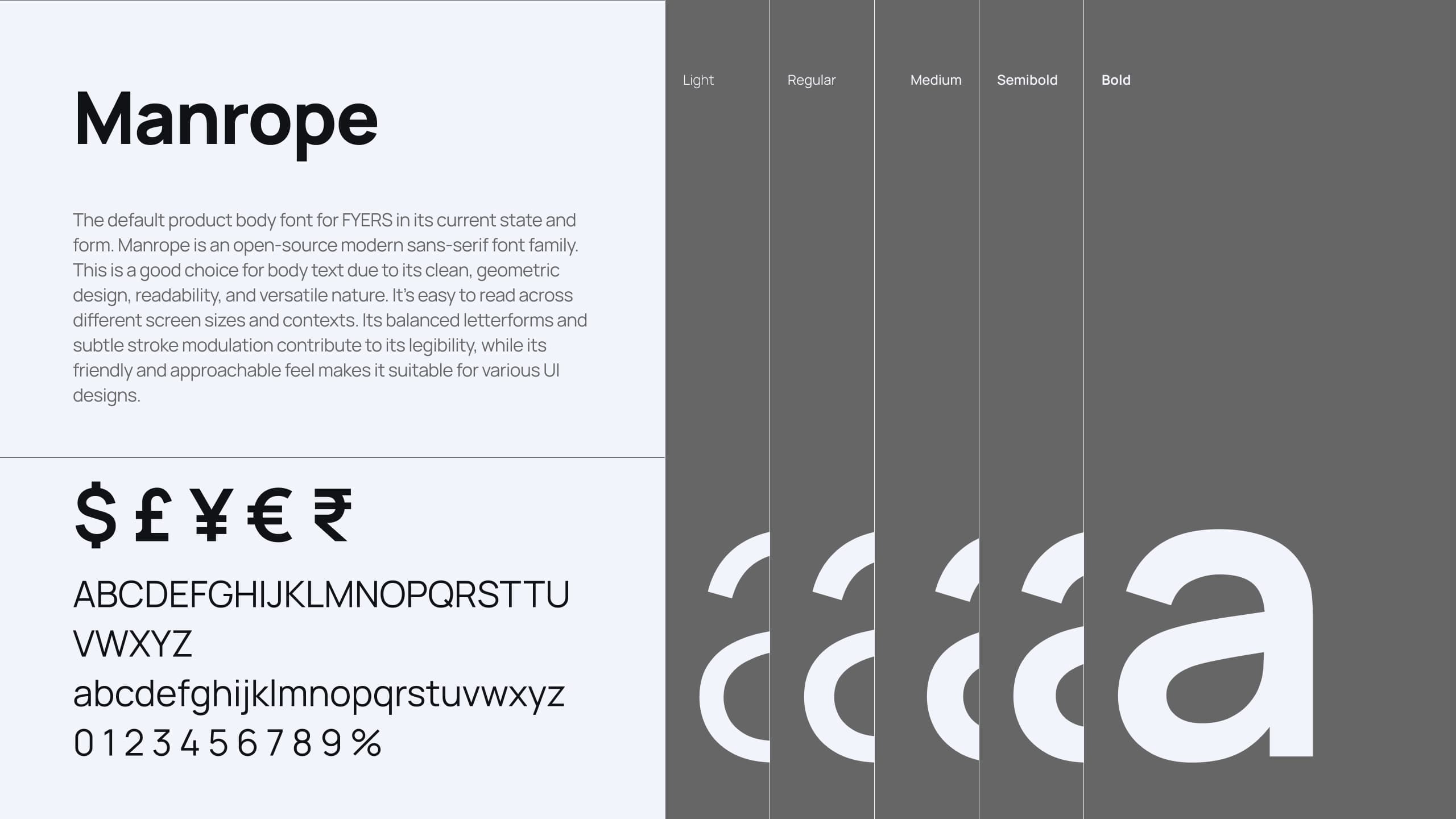
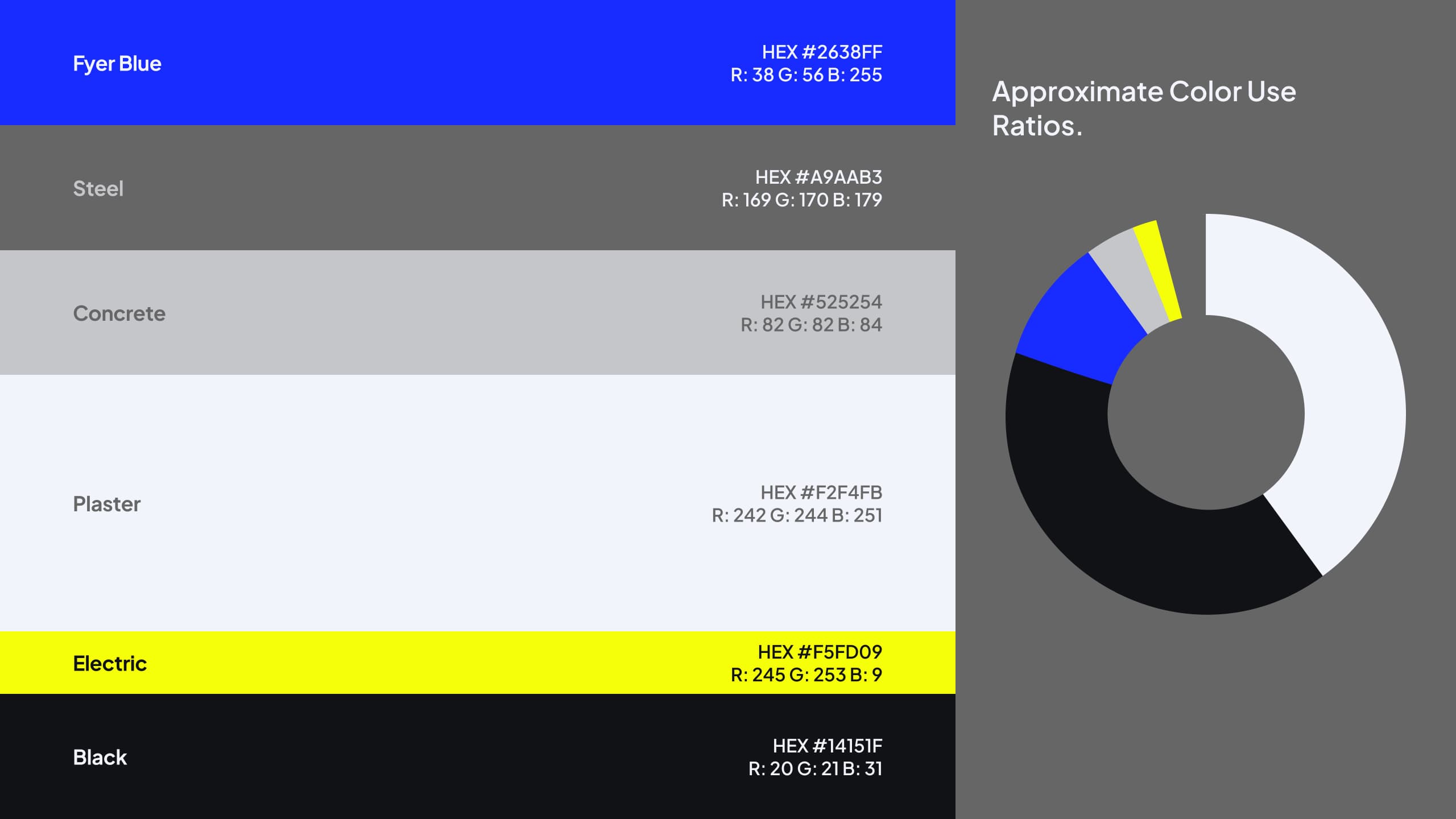
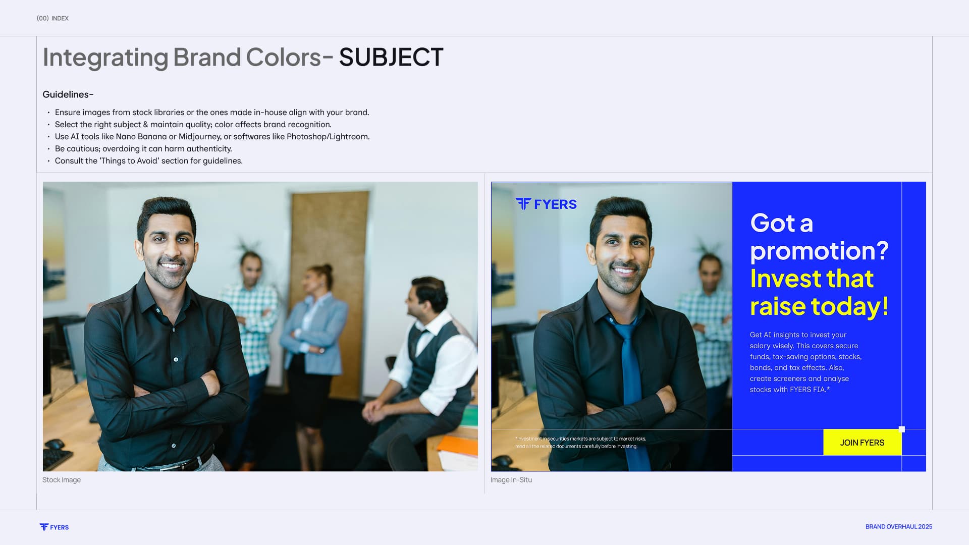
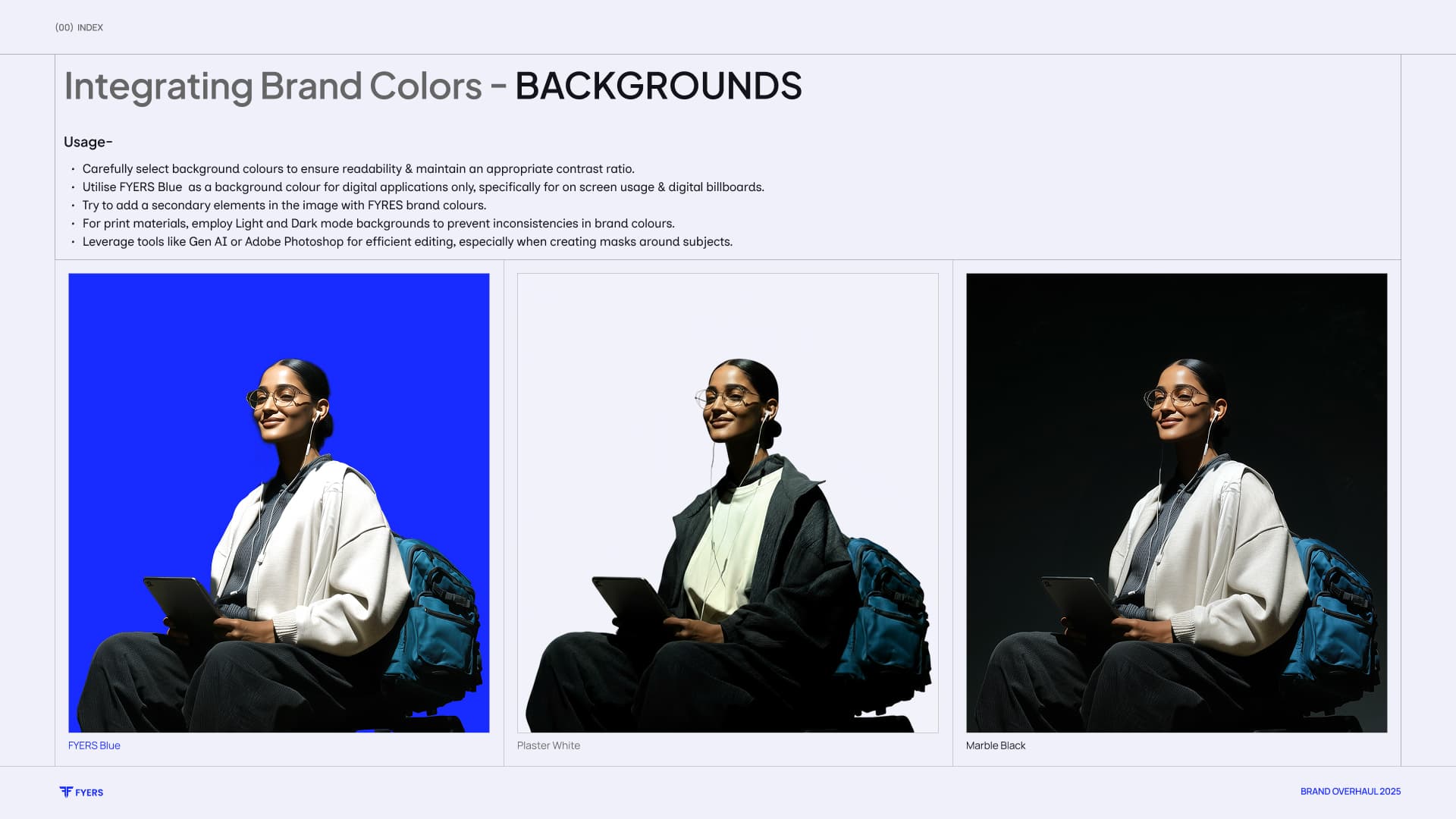
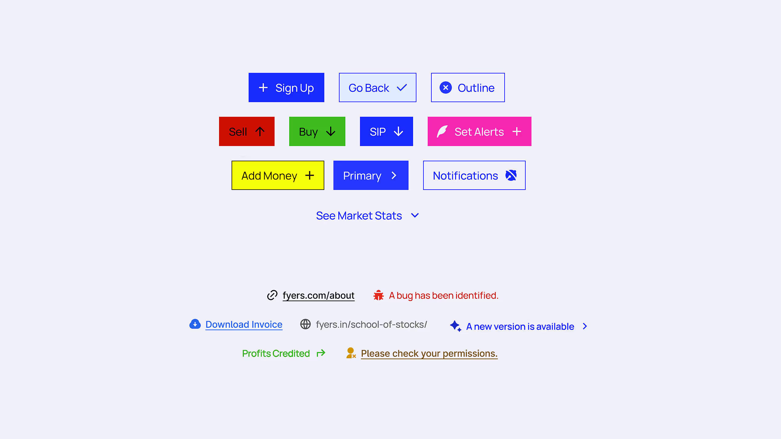
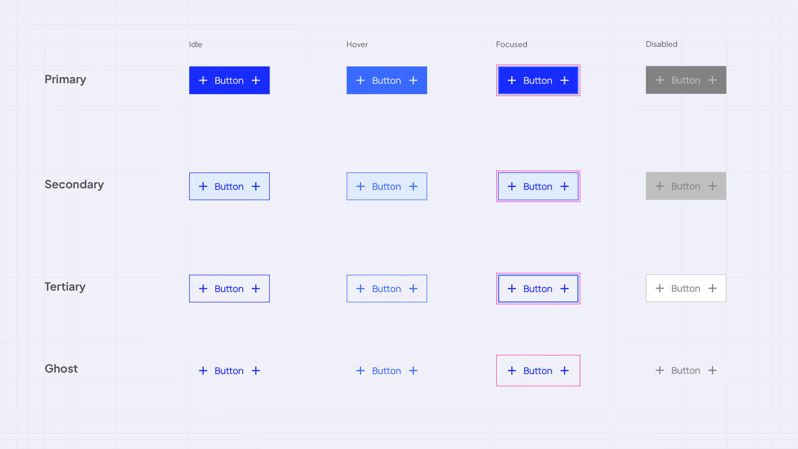
The palette moved from restrained ultramarine and indigo to Fyer Blue, sharp black, and electric yellow-green, supported by structural neutrals. Display type brought confidence; the body system stayed legible across dense, content-heavy surfaces.
01 / 07

01 / 08
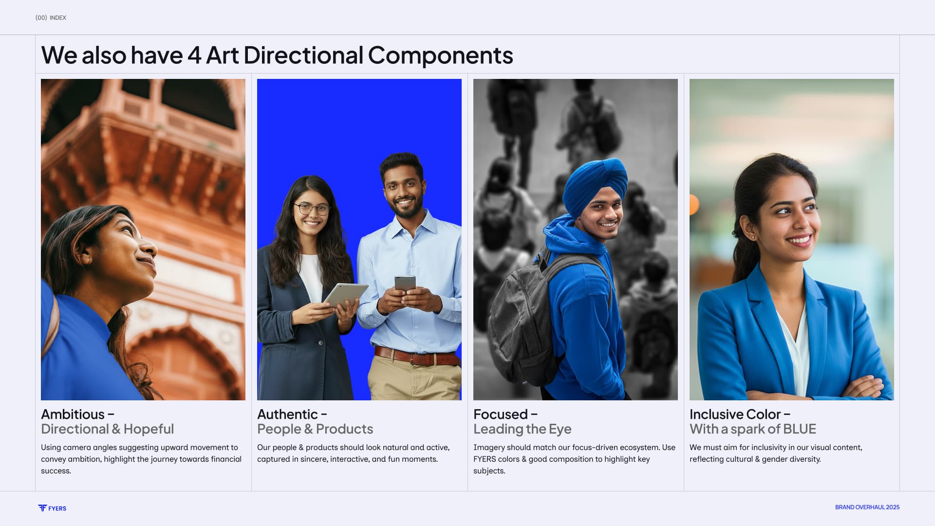
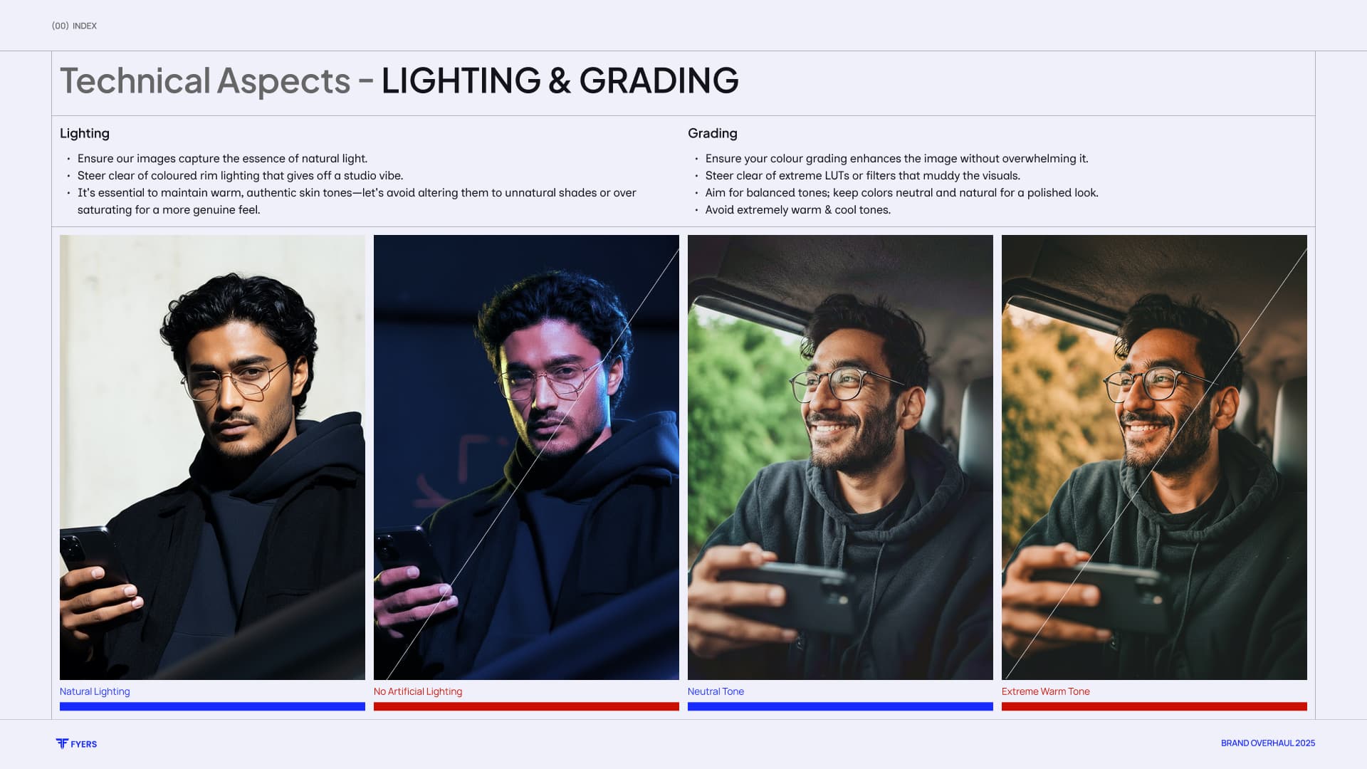
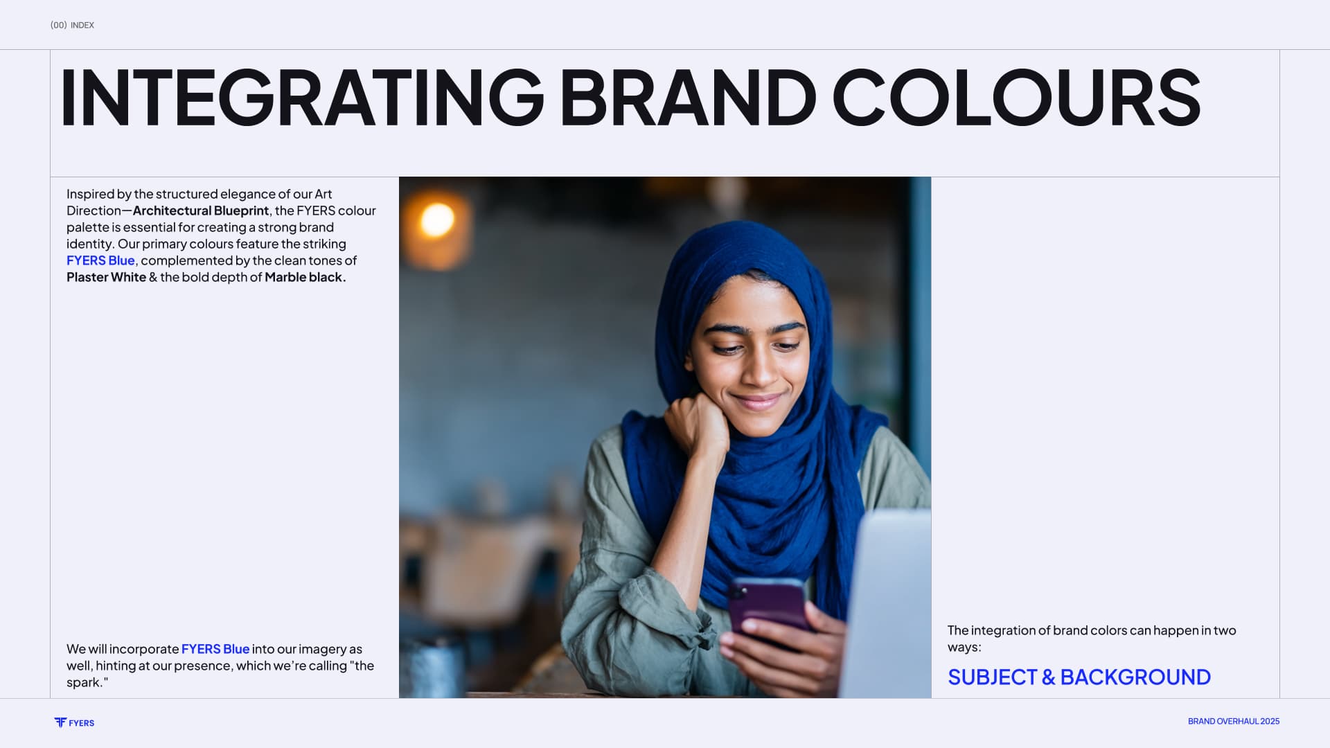
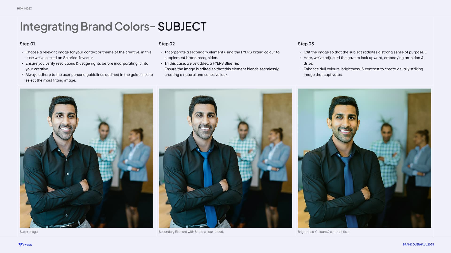
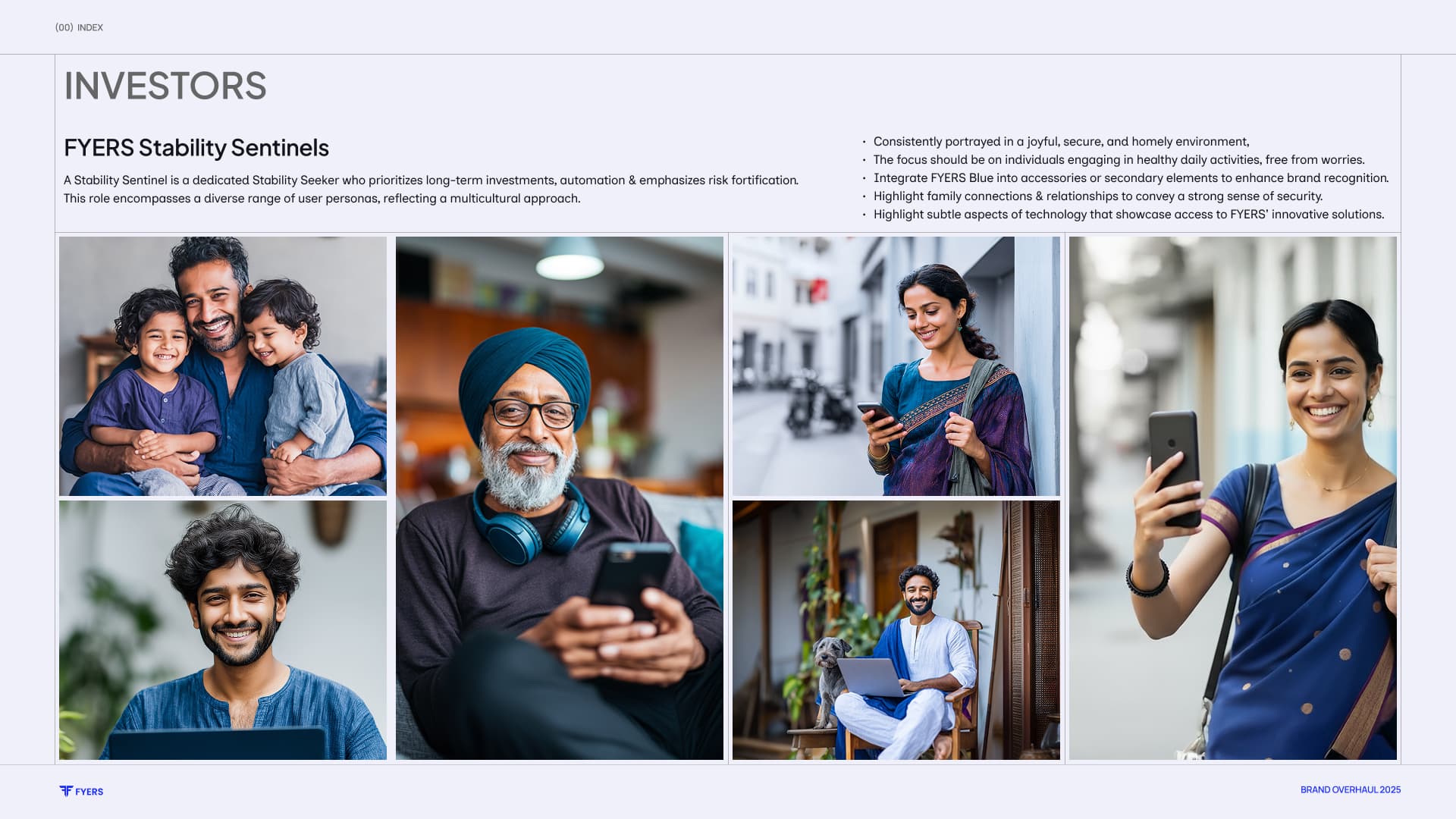
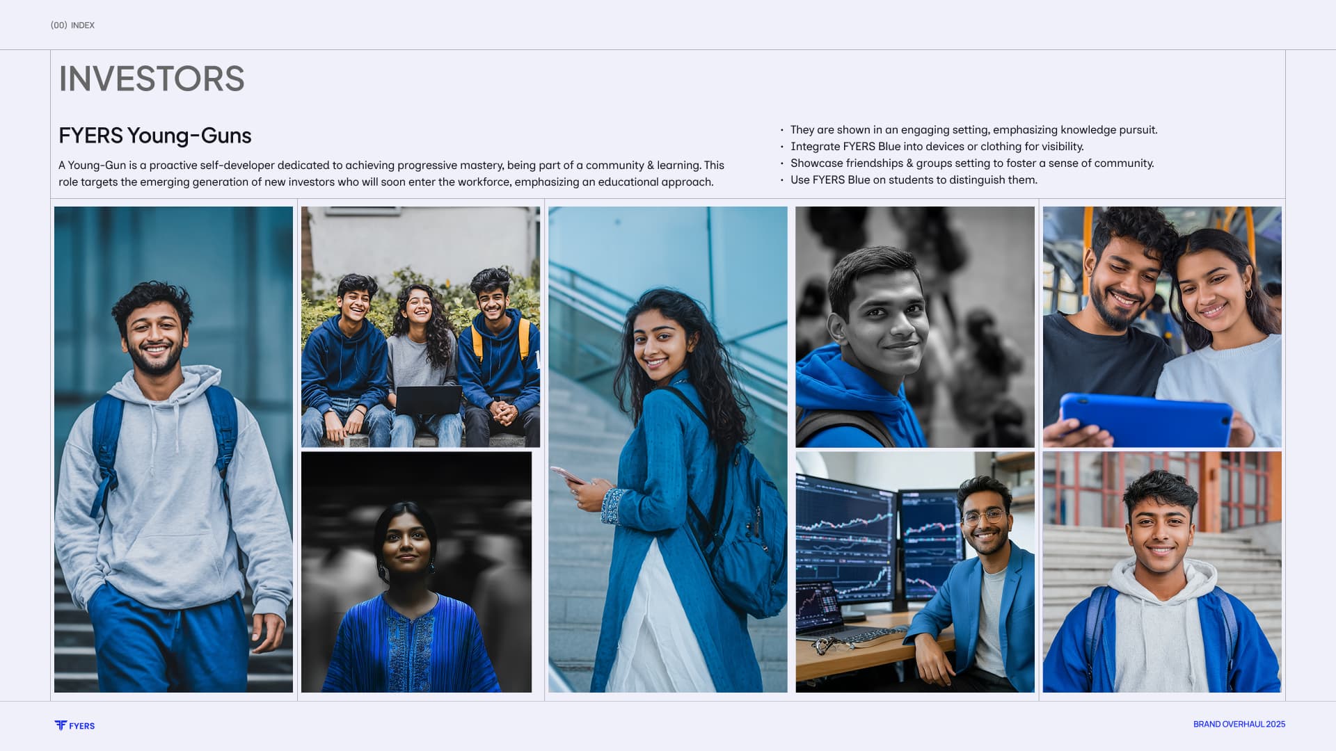
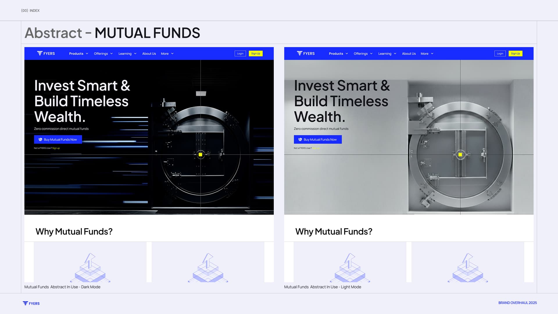
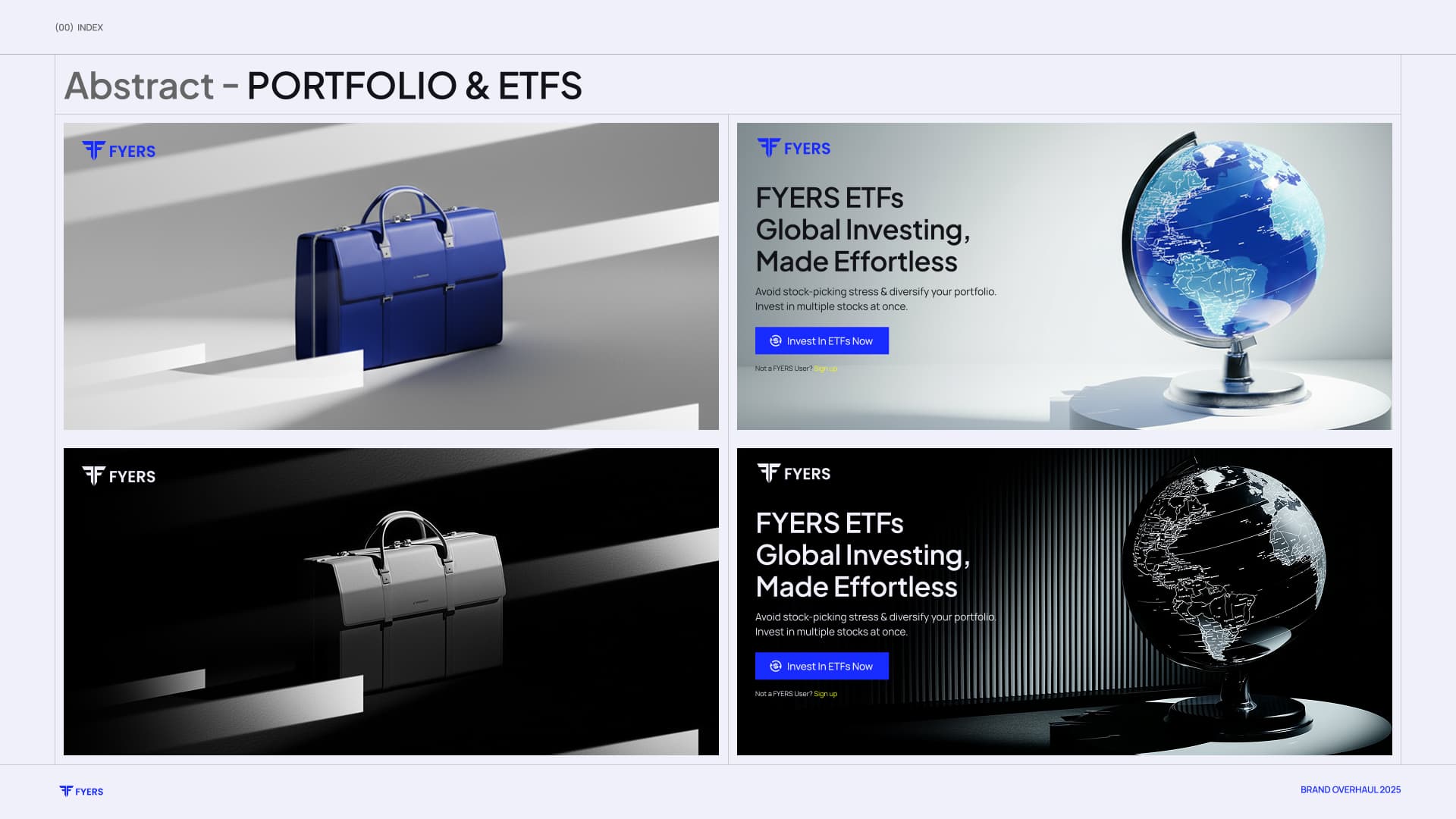
01 / 13
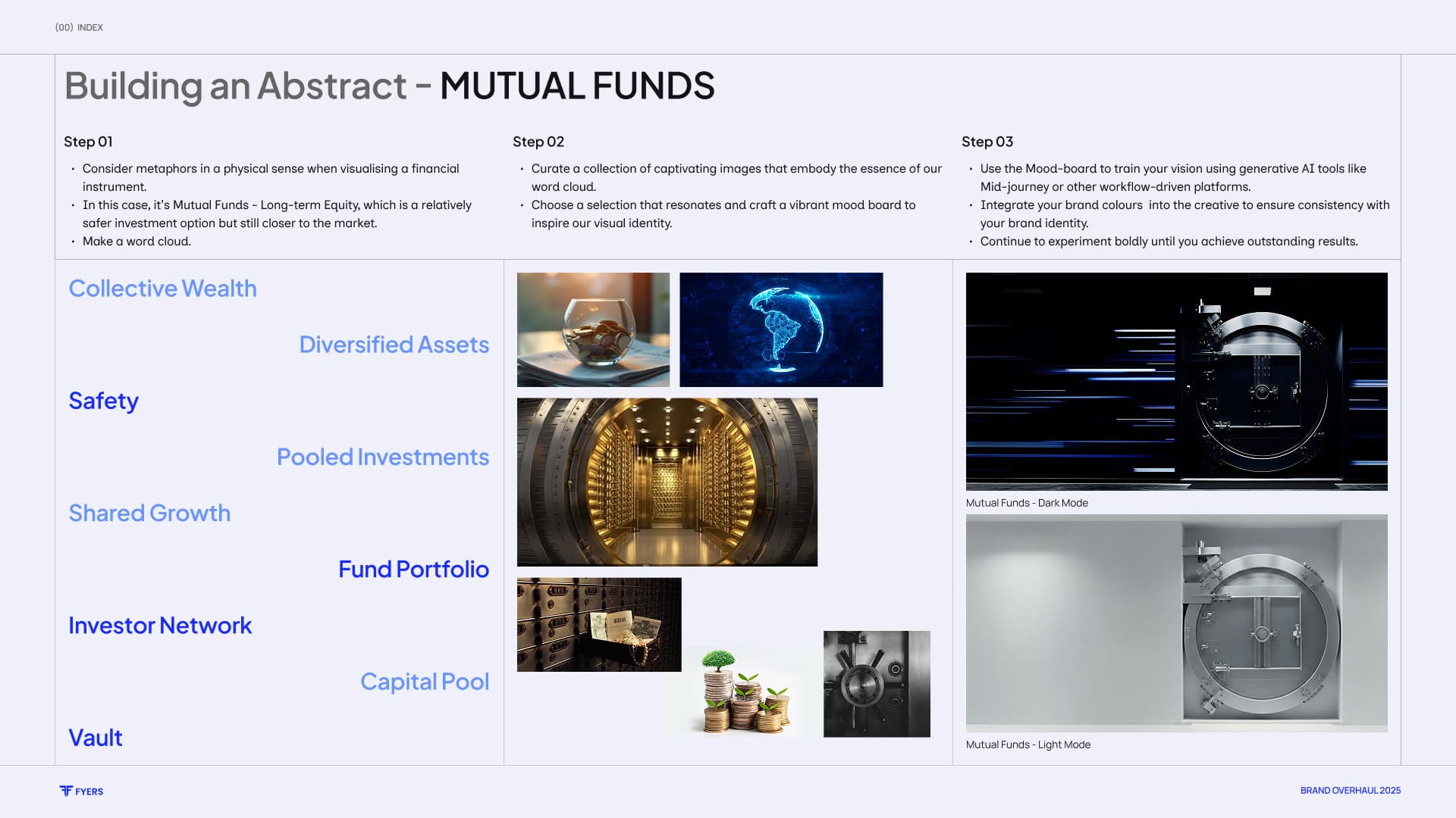
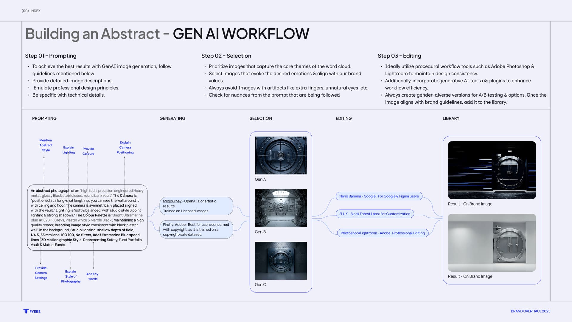


Scale
Can the craft survive production at scale?
The system had to meet a high bar for craft, but also work for fast-turnaround paid media, social, decks, and video. The answer was not to simplify it into something generic; it was to make the logic behind it usable.
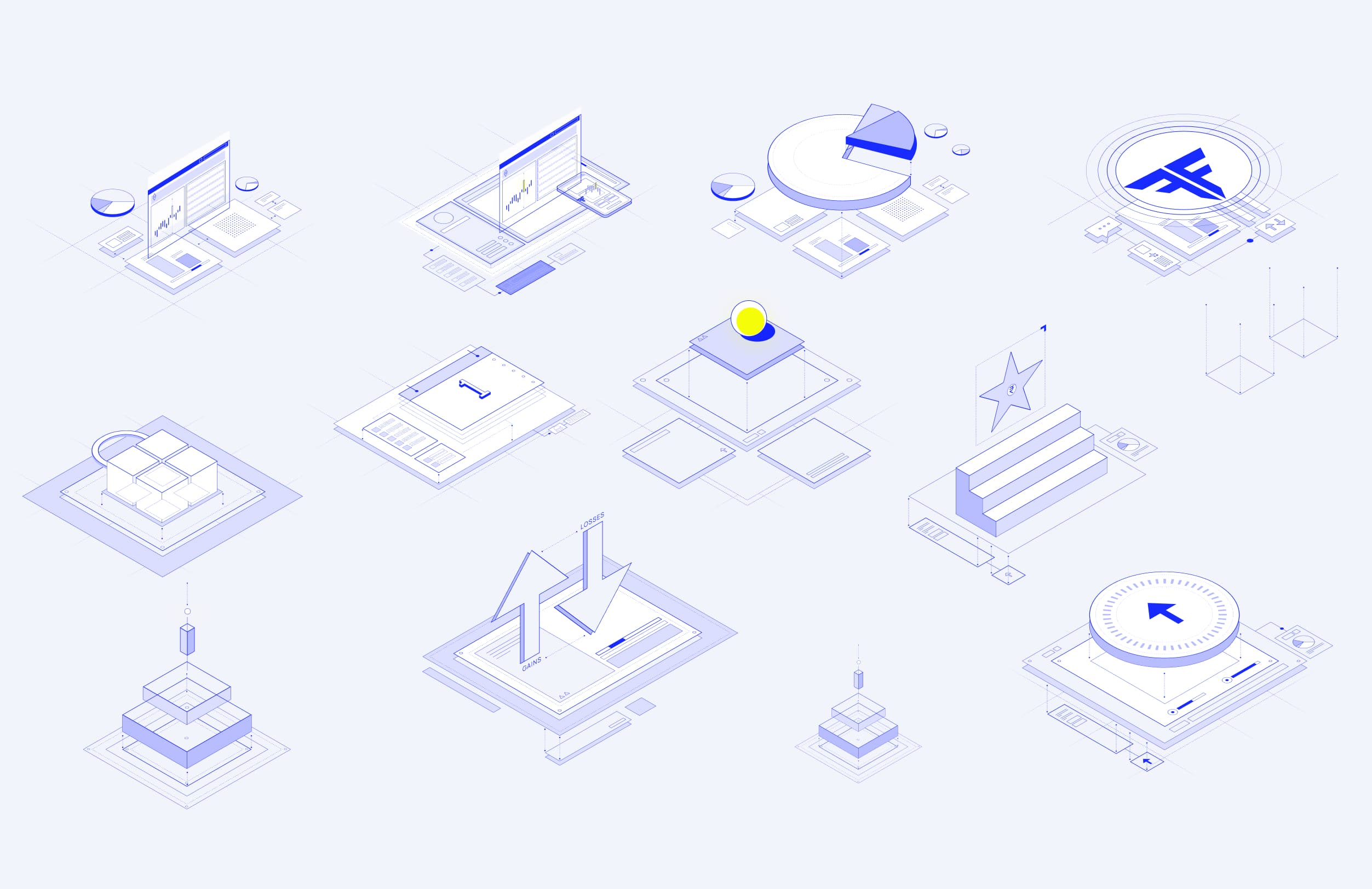
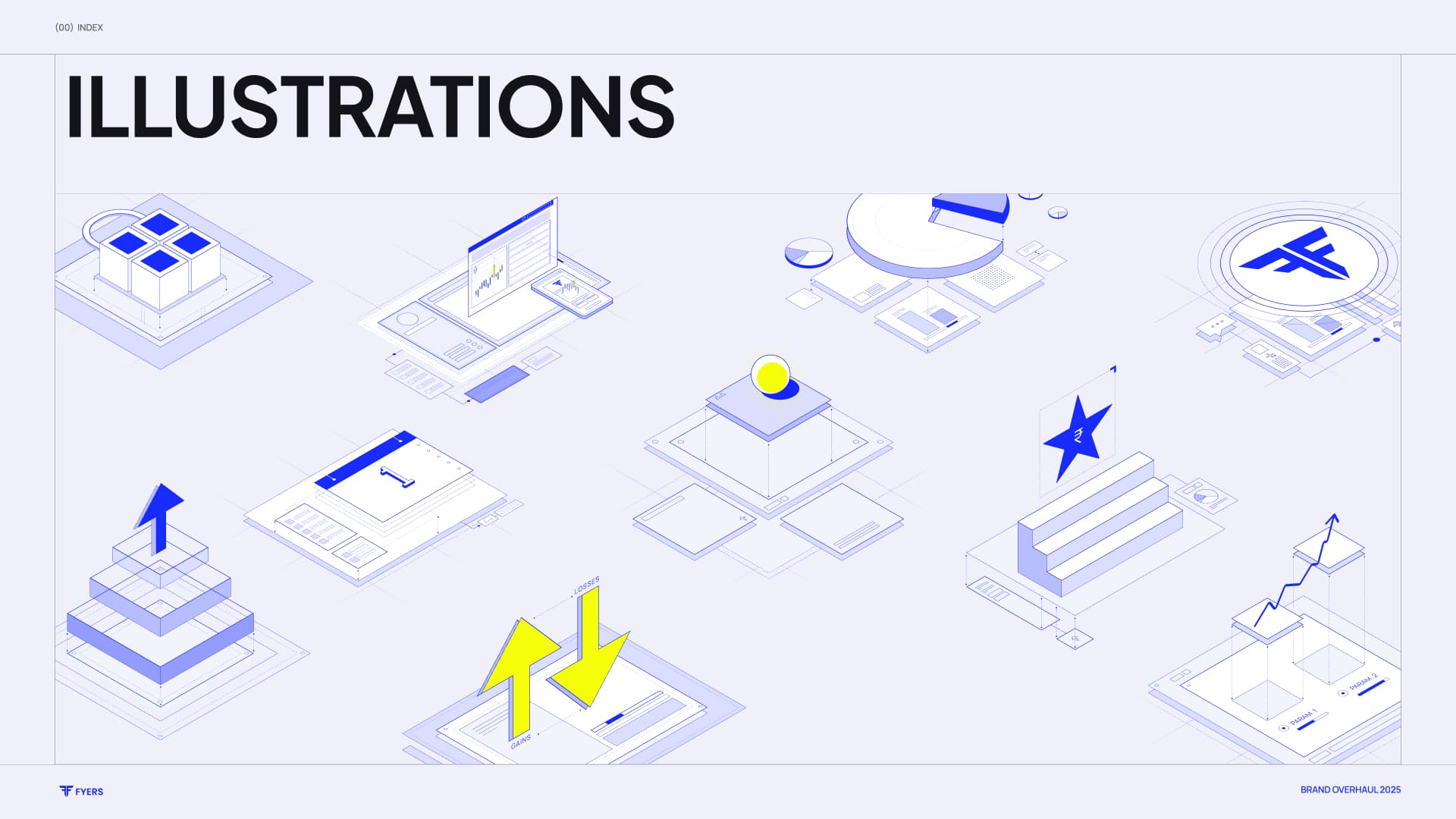
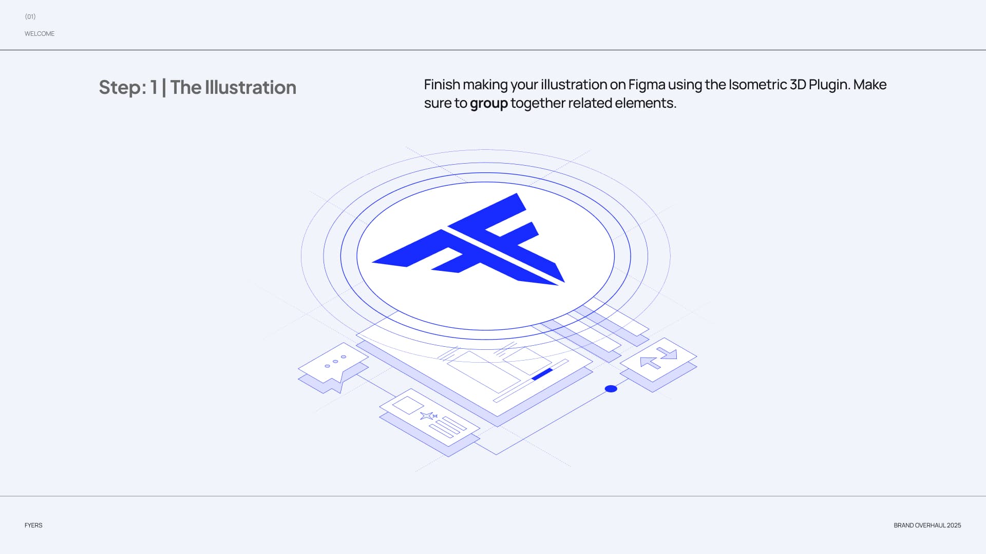
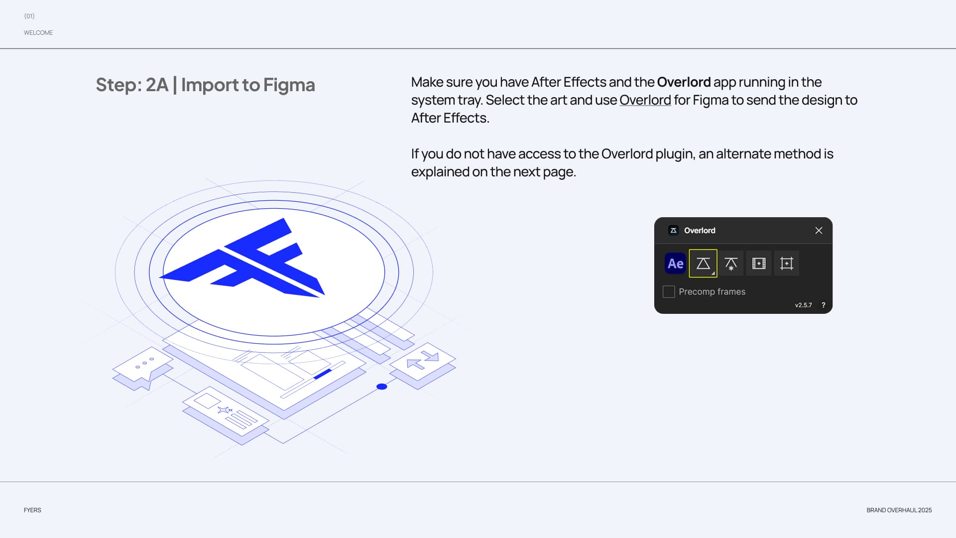
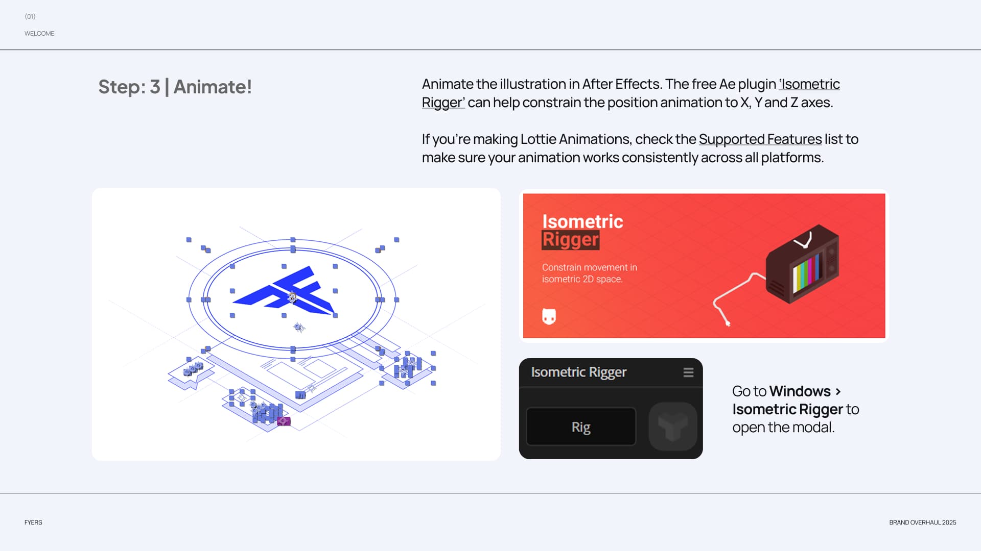
A modular illustration system, built on isometric grids and blueprint geometry, could be broken apart, recombined, and adapted without losing its language. The final library included 20–25 custom illustrations alongside guidance for making more.
Keep the product at the centre.
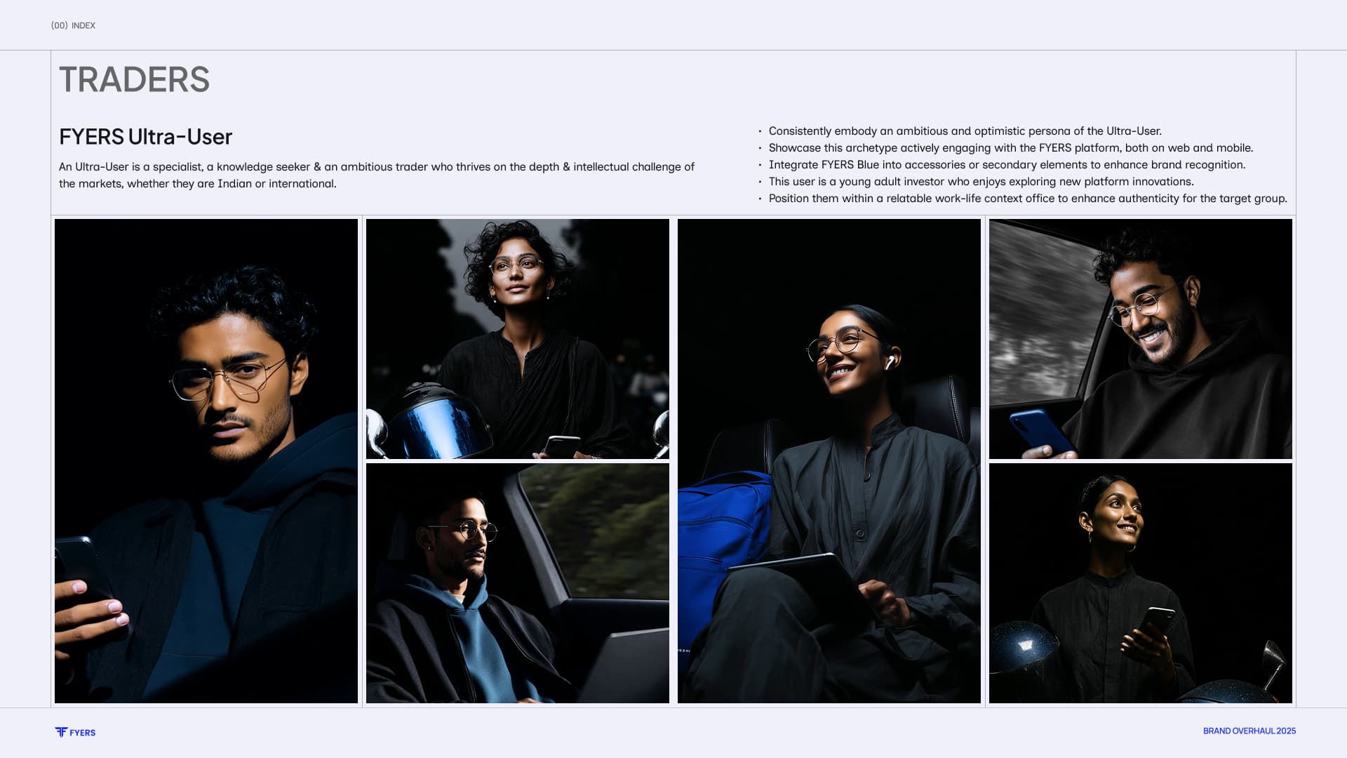
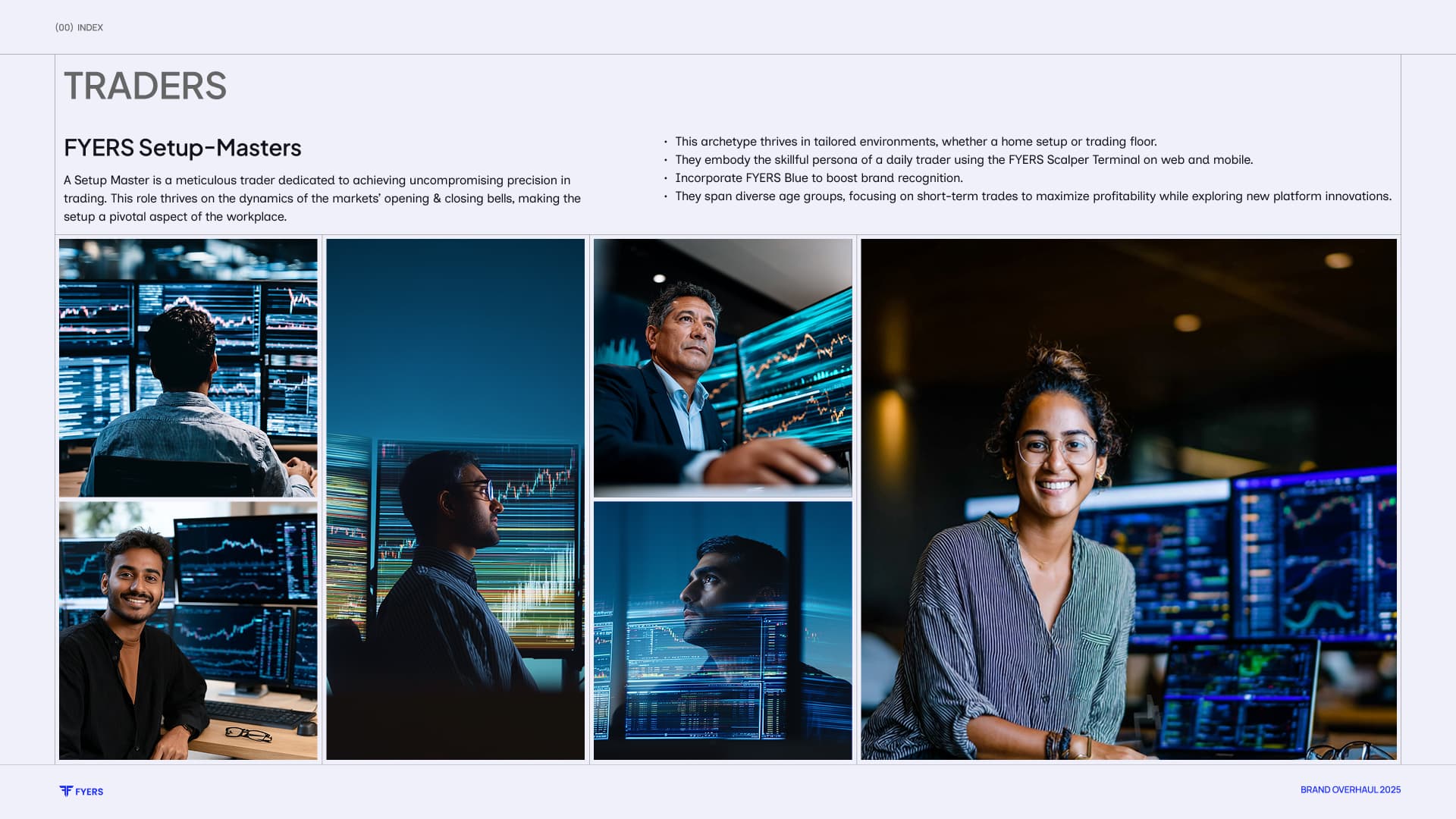
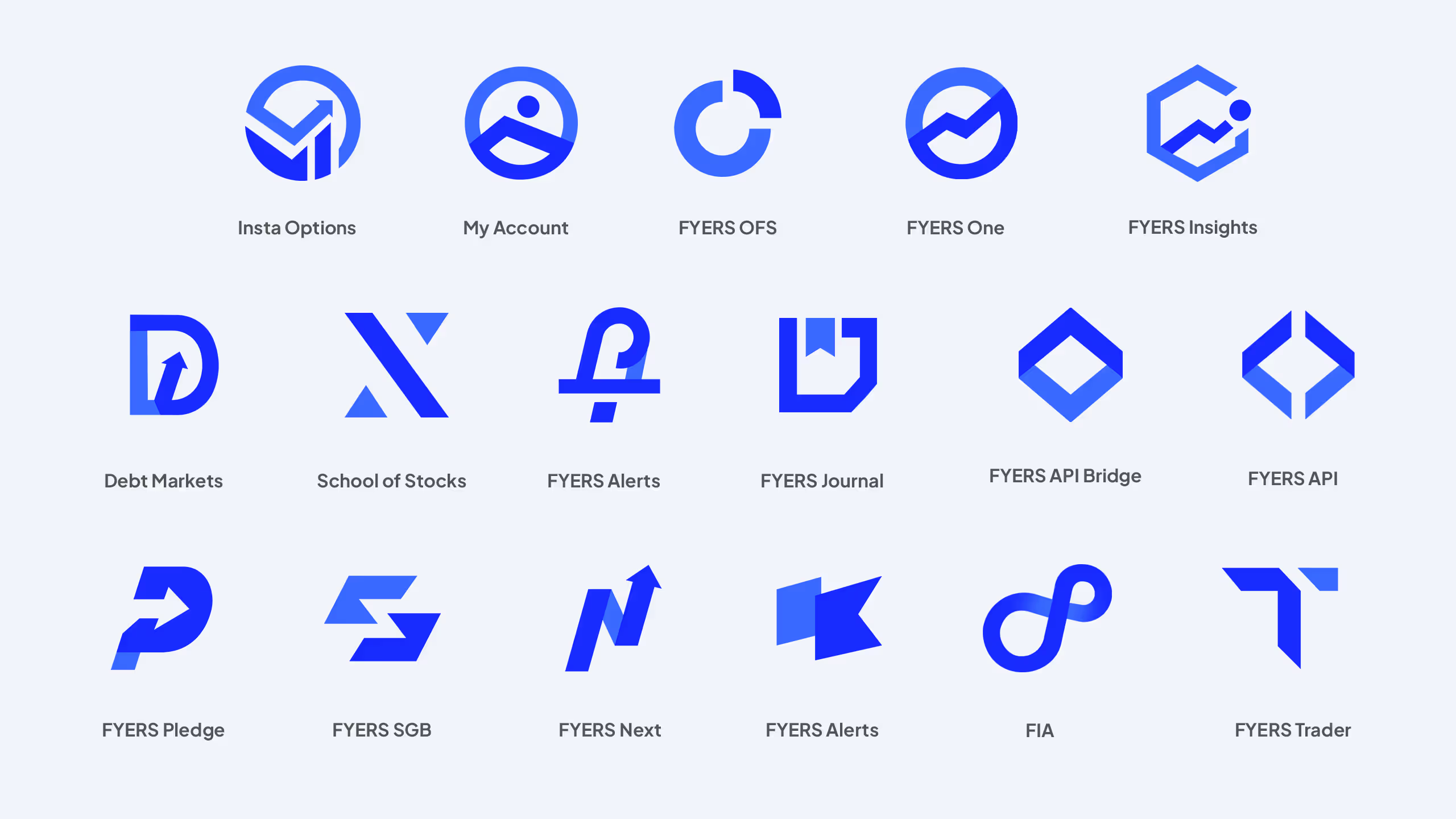
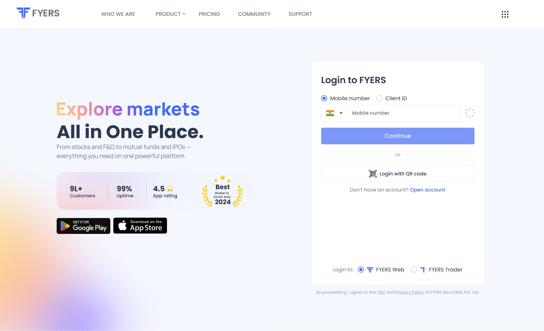
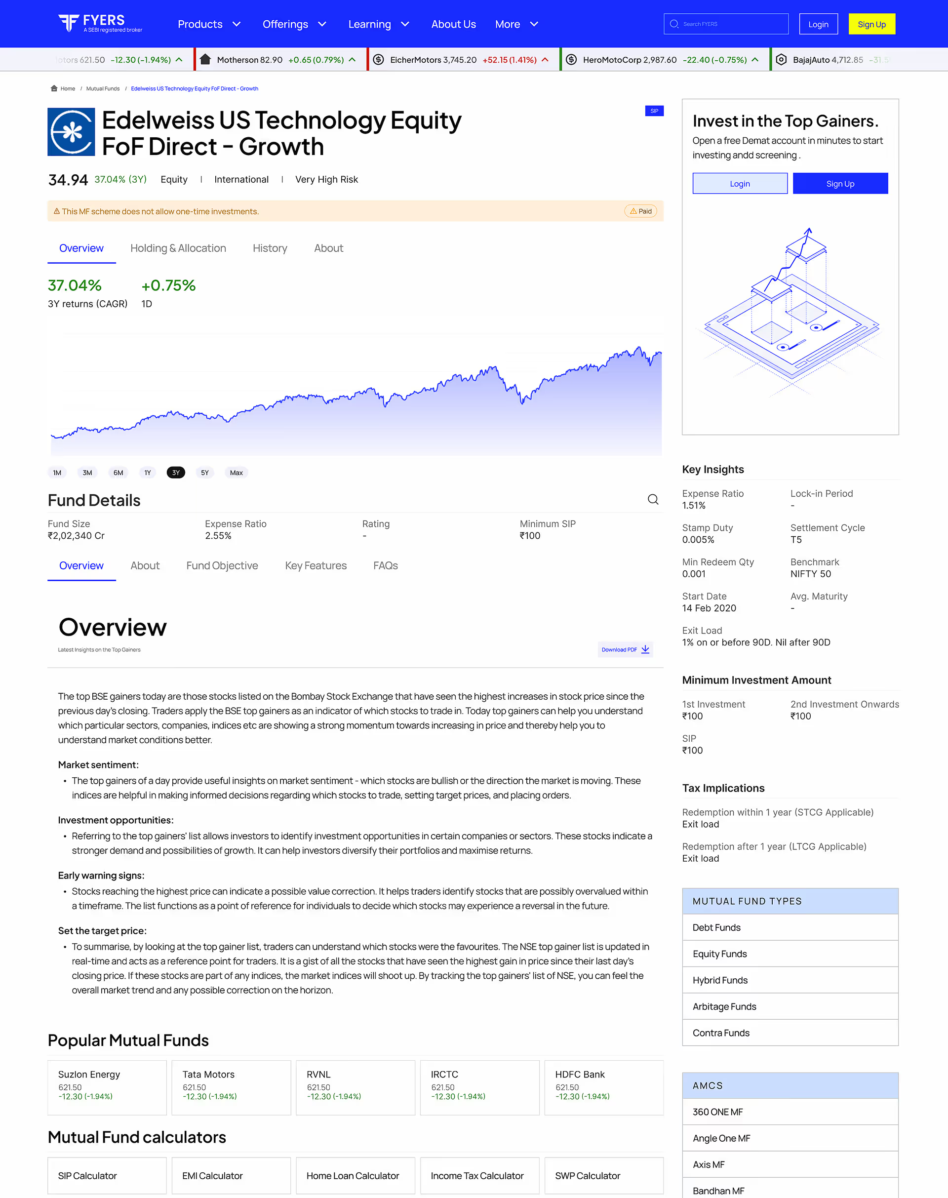
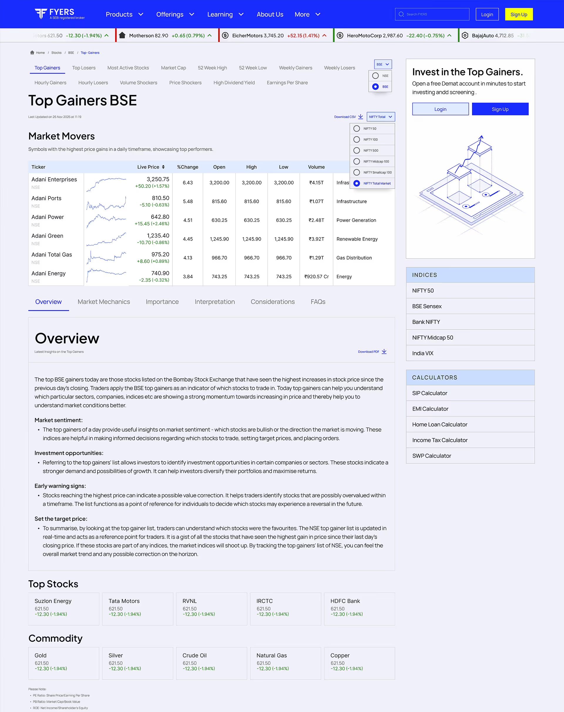
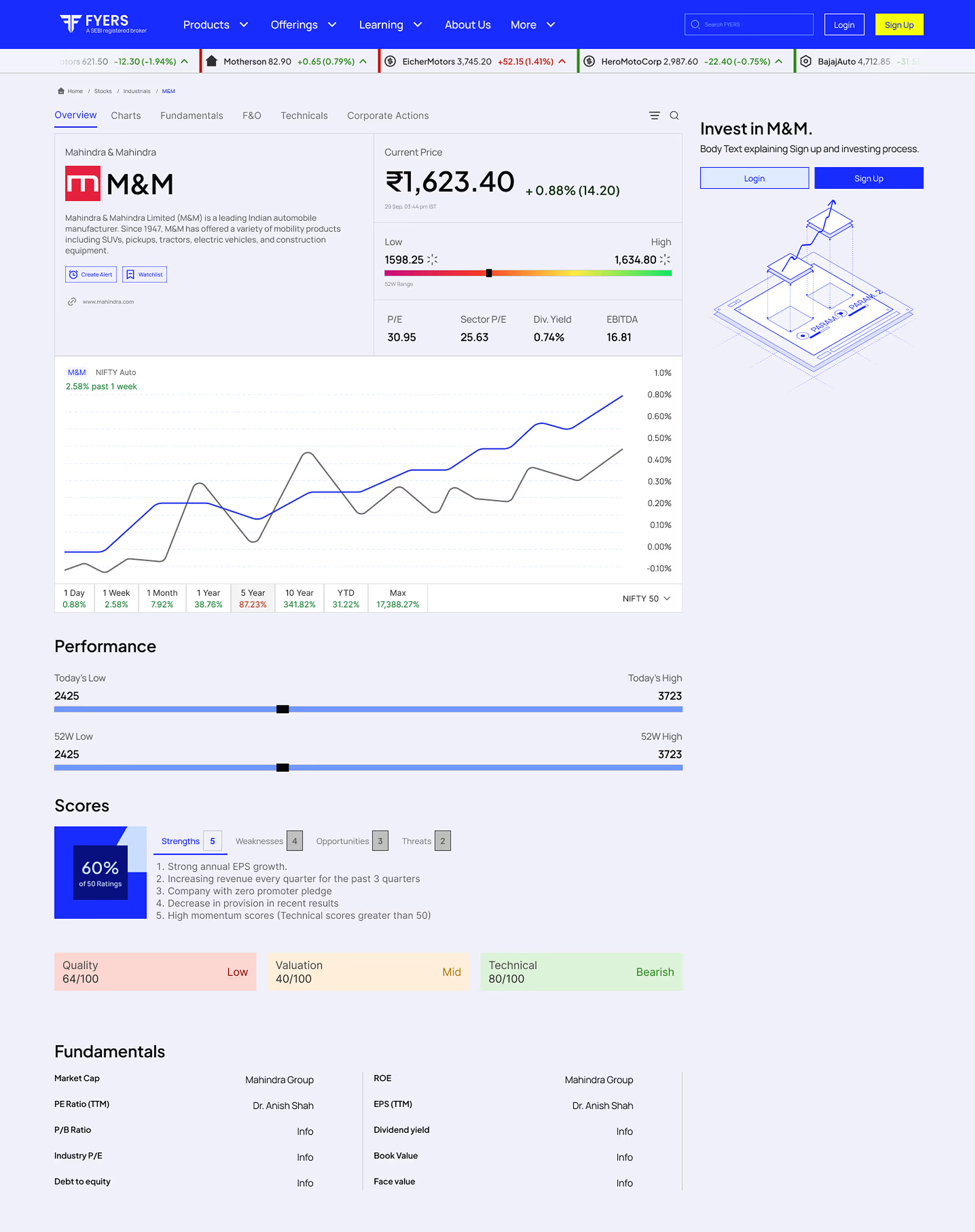
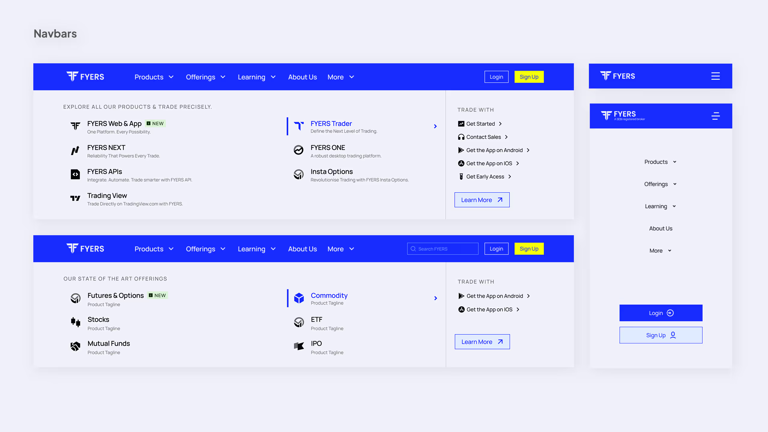
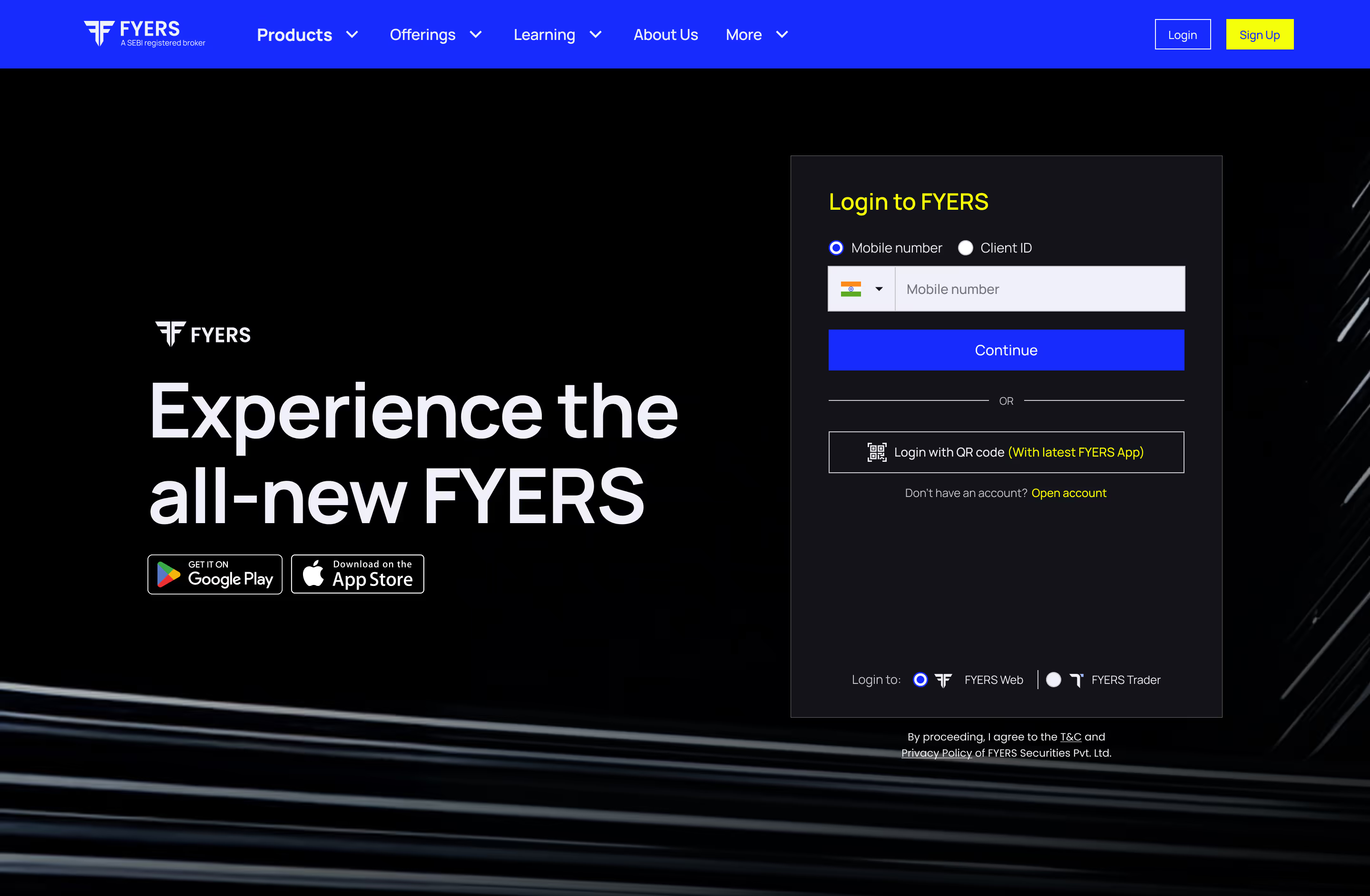
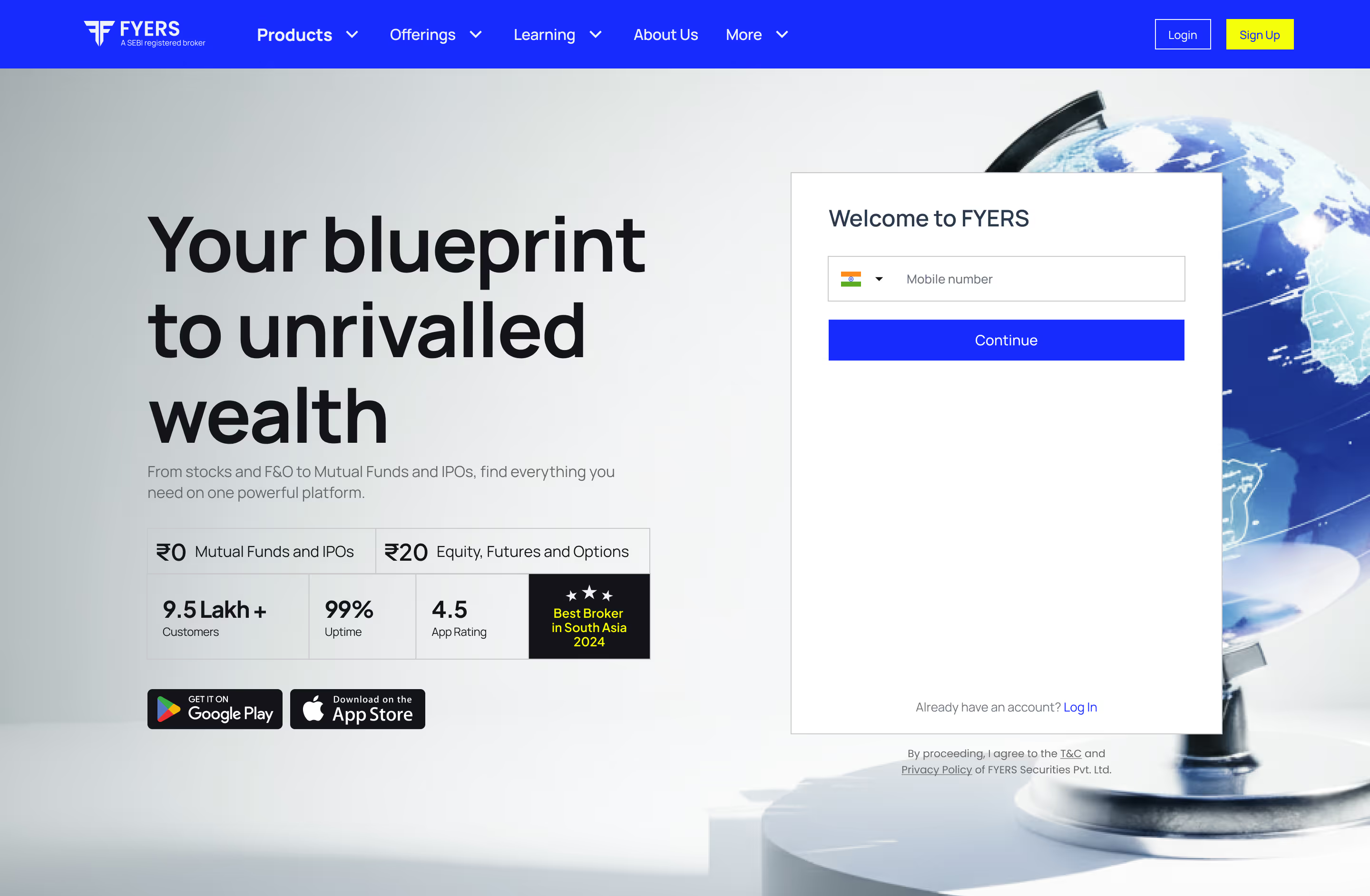
We explored the brand across login, portfolio, and landing-page concepts, not as a full product redesign, but as a provocation for greater coherence. Colour, surface treatment, rounded forms, and deliberate brand imagery became elements the product team could carry into their own system.
 NewPrevious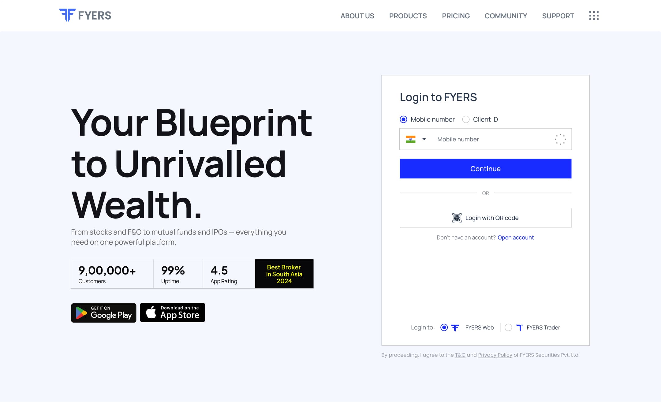
Marketing
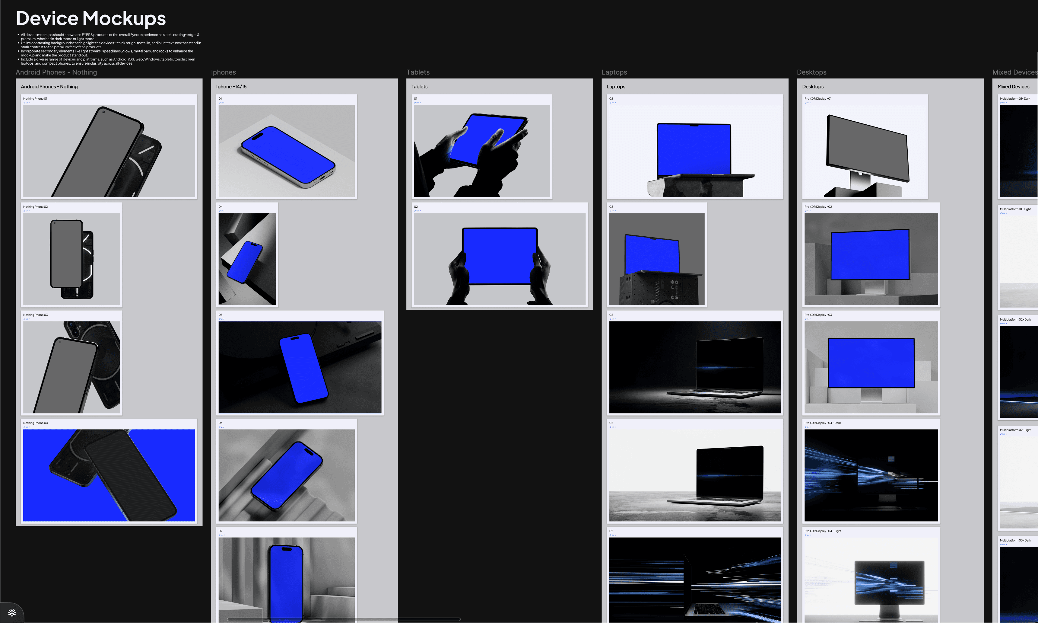
Two modes for telling a product story.
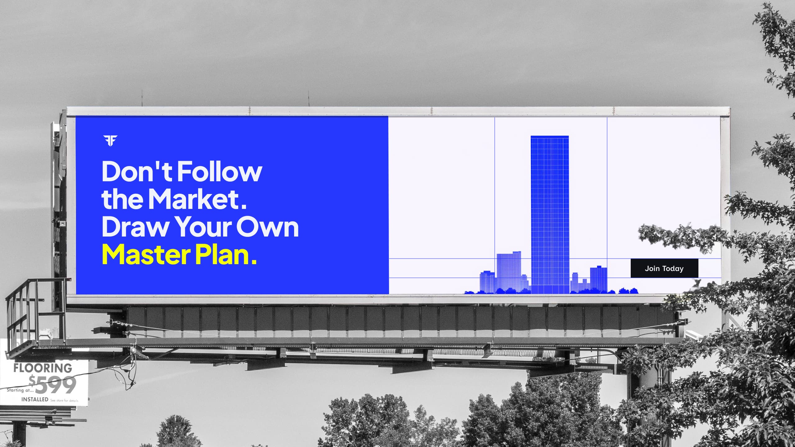
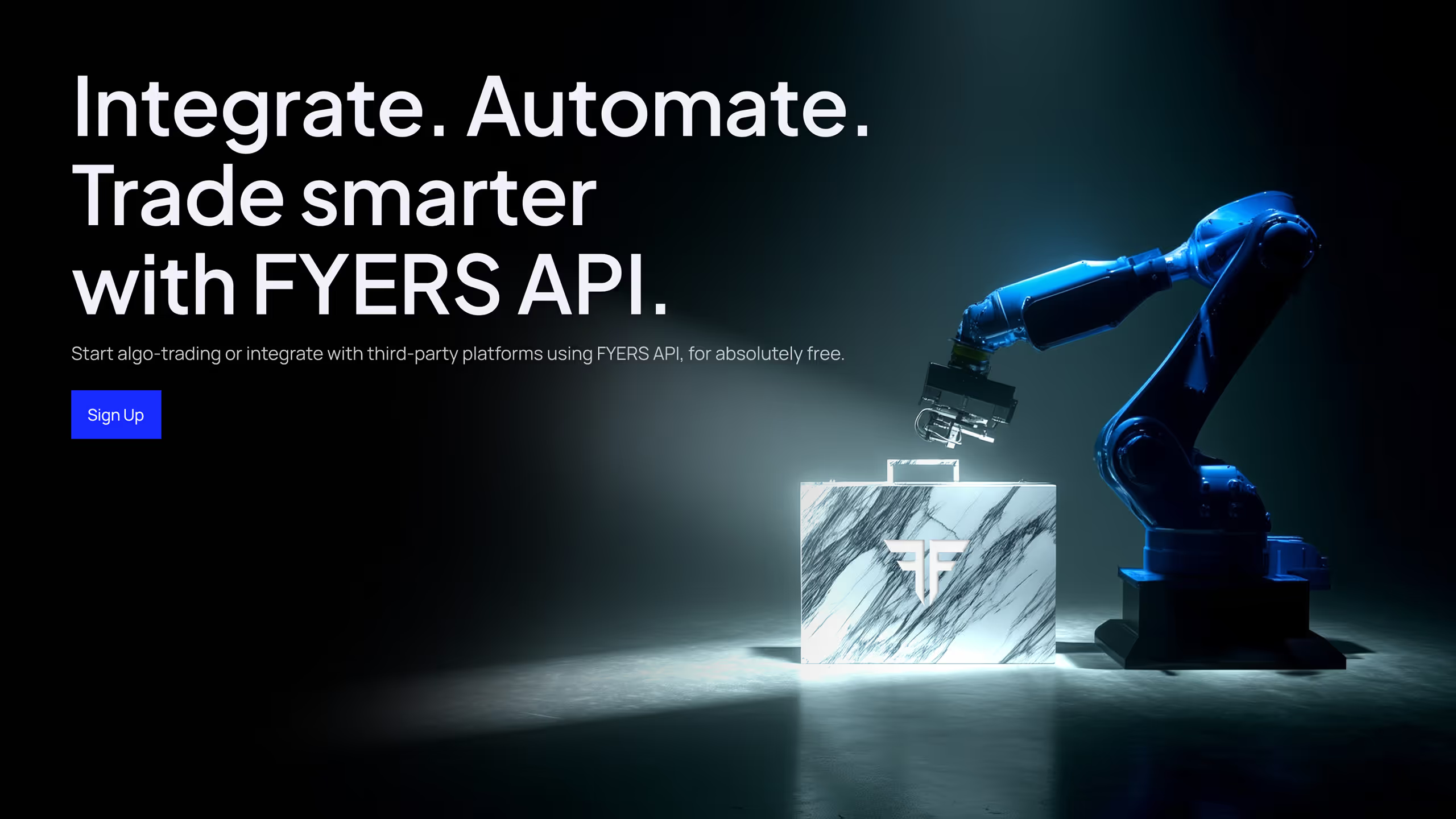
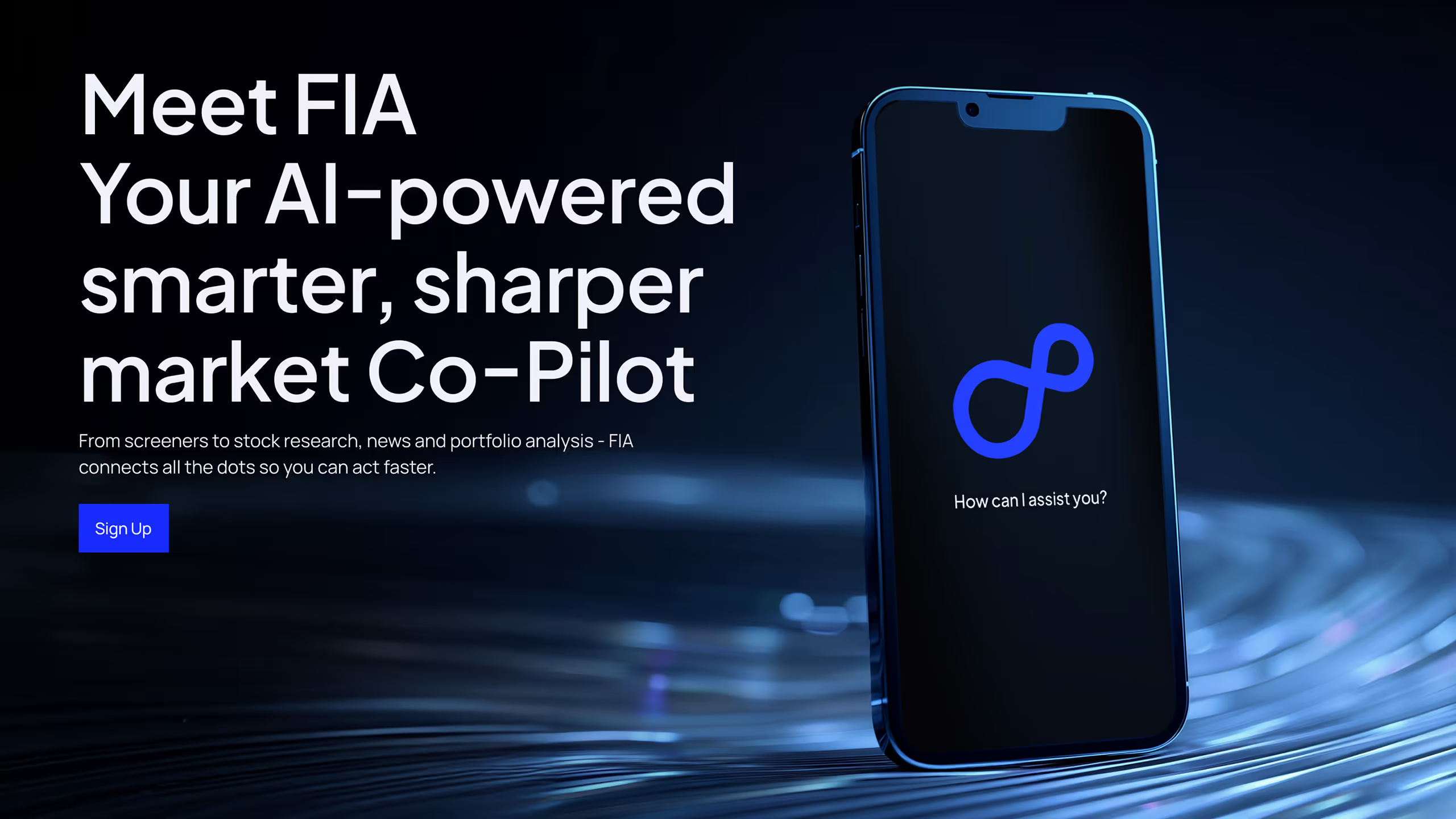
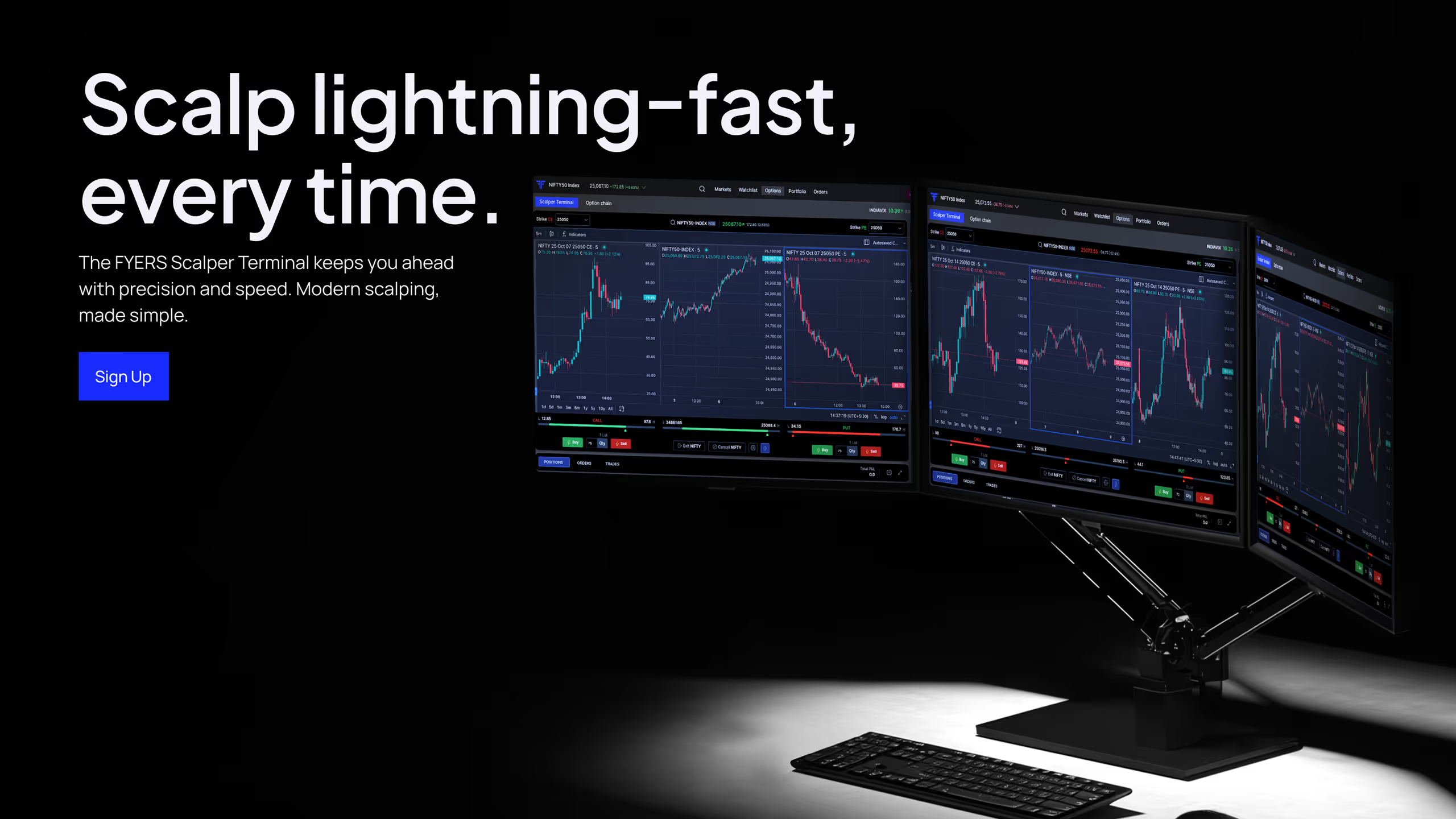
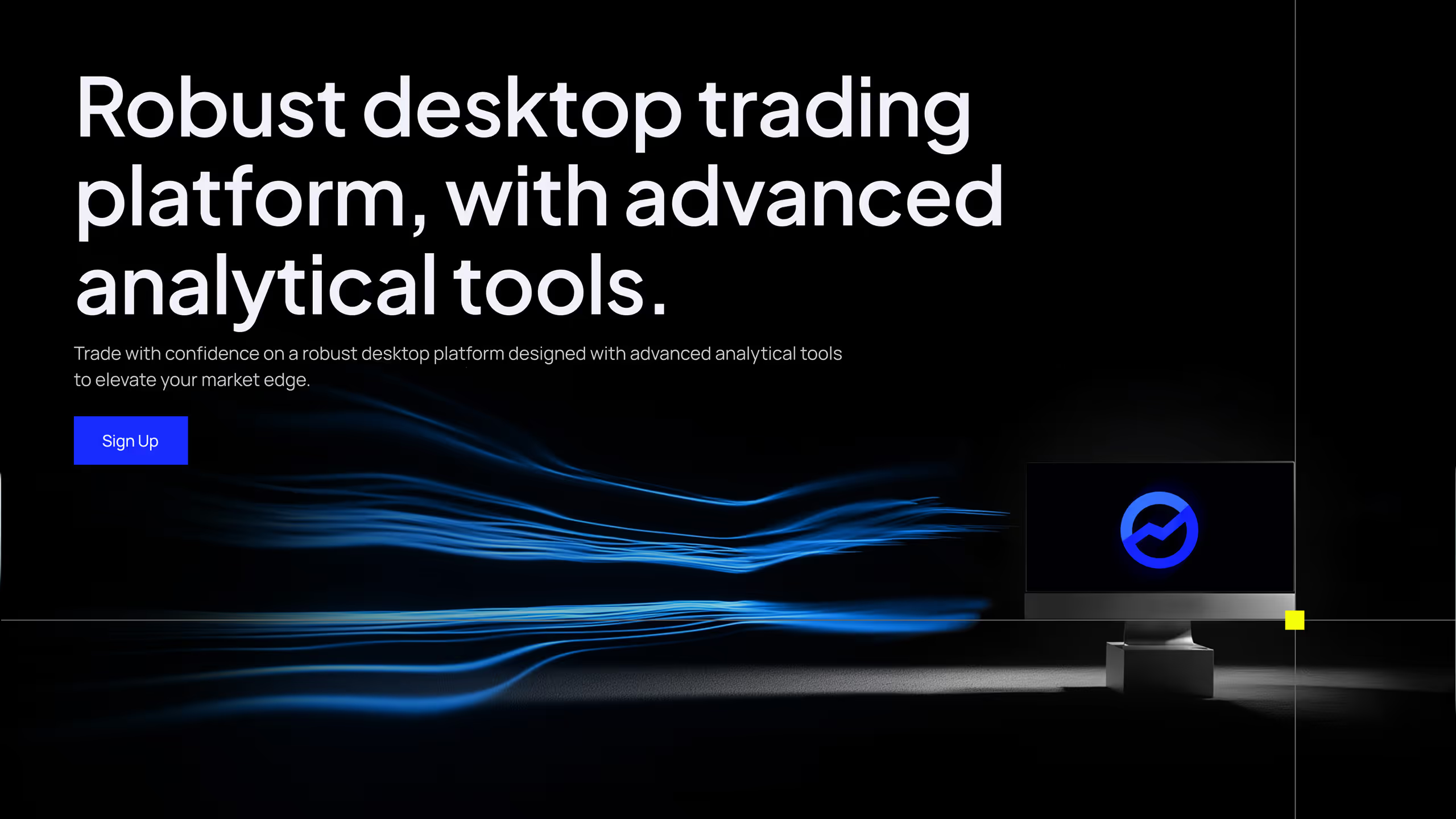
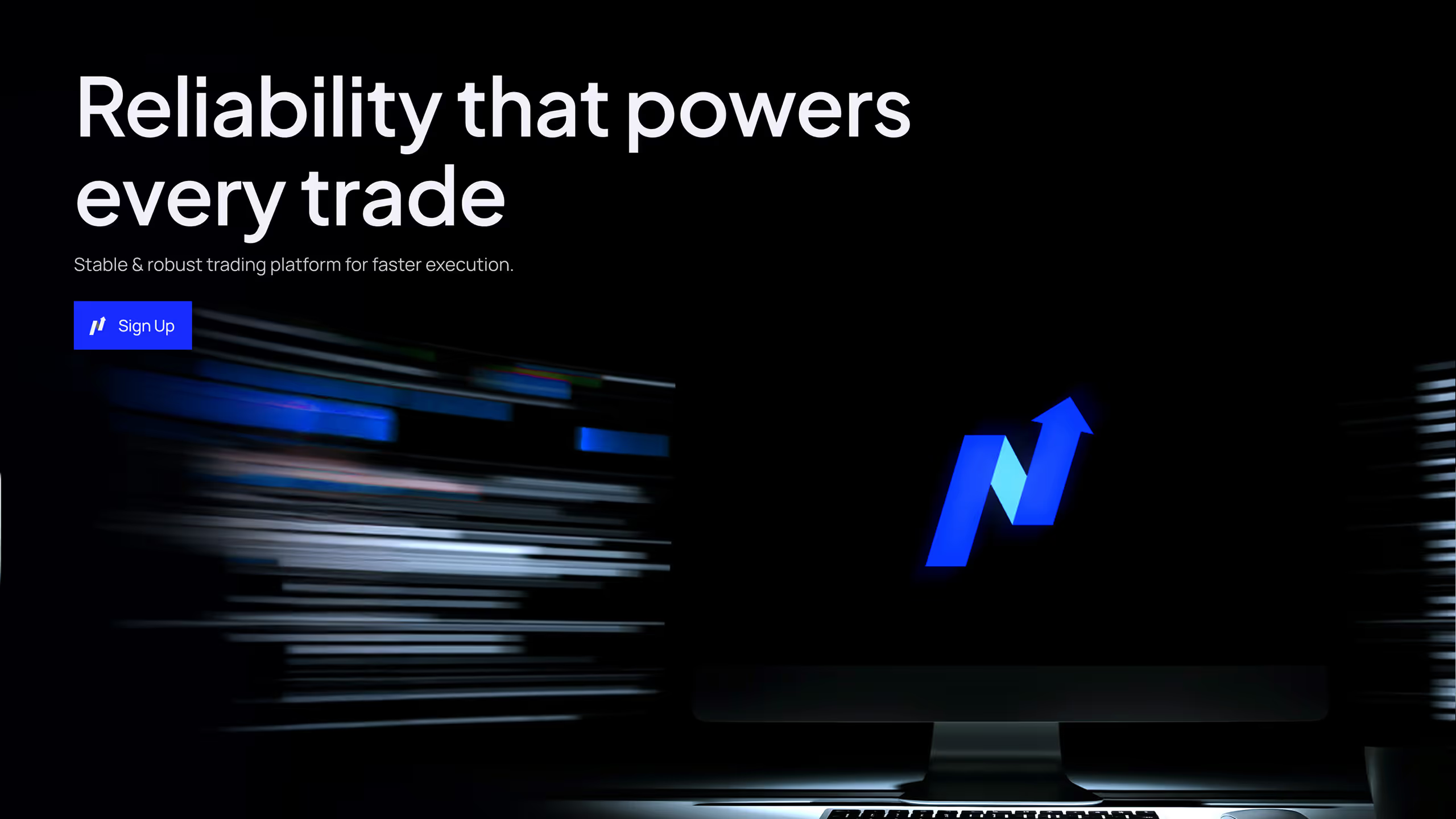
Vibe mockups made hero moments, campaigns, and feature callouts feel aspirational and worth getting closer to. They gave the product emotional pull.
Functional mockups were repeatable compositions designed to explain features clearly inside a larger grid of product stories. Together, the two modes balanced desire with understanding.
A system the team could carry forward.
The work came together in an external-facing guideline, followed by two workshops with roughly 8–10 people from FYERS’ brand and design teams. We mapped the system to real workflows, from motion and content to asset review, so teams could work independently without losing character.
What changed
A brand system should let every team make good decisions on its own.
FYERS gained a distinct visual foundation across illustration, product storytelling, content, and digital surfaces, and a practical way to produce work at speed. The system continues to inform its expanding website and SEO ecosystem. Performance data remains internal, so this is evidence of durable adoption, not a claim about conversion.